【sf-0822】 Google Design, 2022
Define the fundamental pillars of a design system.
【check】Create visuals with a unique ownable character.
【check】 Shape the social appearance of one of the biggest brands in the world. 【check】
These were just some of the initial tasks on our ToDo list after our long-term collaborator Nando Costa, Director of Google Design Outreach, got in touch with an intriguing proposal: A short but intense design phase that purely focuses on visual research and creative development. The objective of our first collaboration with Google Design was nothing less than tapping into new creative directions for Google’s outreach and find an inspiring visual representation of the incredible UI work they have done in recent years.
These were just some of the initial tasks on our ToDo list after our long-term collaborator Nando Costa, Director of Google Design Outreach, got in touch with an intriguing proposal: A short but intense design phase that purely focuses on visual research and creative development. The objective of our first collaboration with Google Design was nothing less than tapping into new creative directions for Google’s outreach and find an inspiring visual representation of the incredible UI work they have done in recent years.
The outcome of letting us roam freely through the creative landscapes are a wealth of ideas, a pool of over 100 images and a big collection of independent motion concepts. To tip it all off we created a 25 second hero animation that utilises some of the ideas created in our RnD process.
And while all of these images and animations are conceptual prototypes that serve as a base for future projects to come, we couldn’t be happier about another inspiring and energizing collaboration with an exceptional client.
And while all of these images and animations are conceptual prototypes that serve as a base for future projects to come, we couldn’t be happier about another inspiring and energizing collaboration with an exceptional client.
【brief】
Our initial brief evolved around the idea of building a narrative that travels through different levels of detail and touches upon different aspects of the “MaterialYou” user interface design. From the smallest particle, to parts of the UI, to Google’s very own devices in a semi-realistic environment.
Aesthetically our research evolved around defining a palette of materials, objects and tactile qualities that would be ownable by Google Design. Not only to distinguish the designs from those of competitors, but also to express an emotional quality that suits the overall brand expression. Some of these qualities included approachability, warmth, friendliness, which in turn resulted in soft materialities, organic forms and playful and engaging shapes.
Aesthetically our research evolved around defining a palette of materials, objects and tactile qualities that would be ownable by Google Design. Not only to distinguish the designs from those of competitors, but also to express an emotional quality that suits the overall brand expression. Some of these qualities included approachability, warmth, friendliness, which in turn resulted in soft materialities, organic forms and playful and engaging shapes.
Atomic Unit:
The world of the “Atomic Unit” is purely abstract. It is the foundation of our design system and defines the smallest unit possible, giving the digital system a semi-realistic limitation.
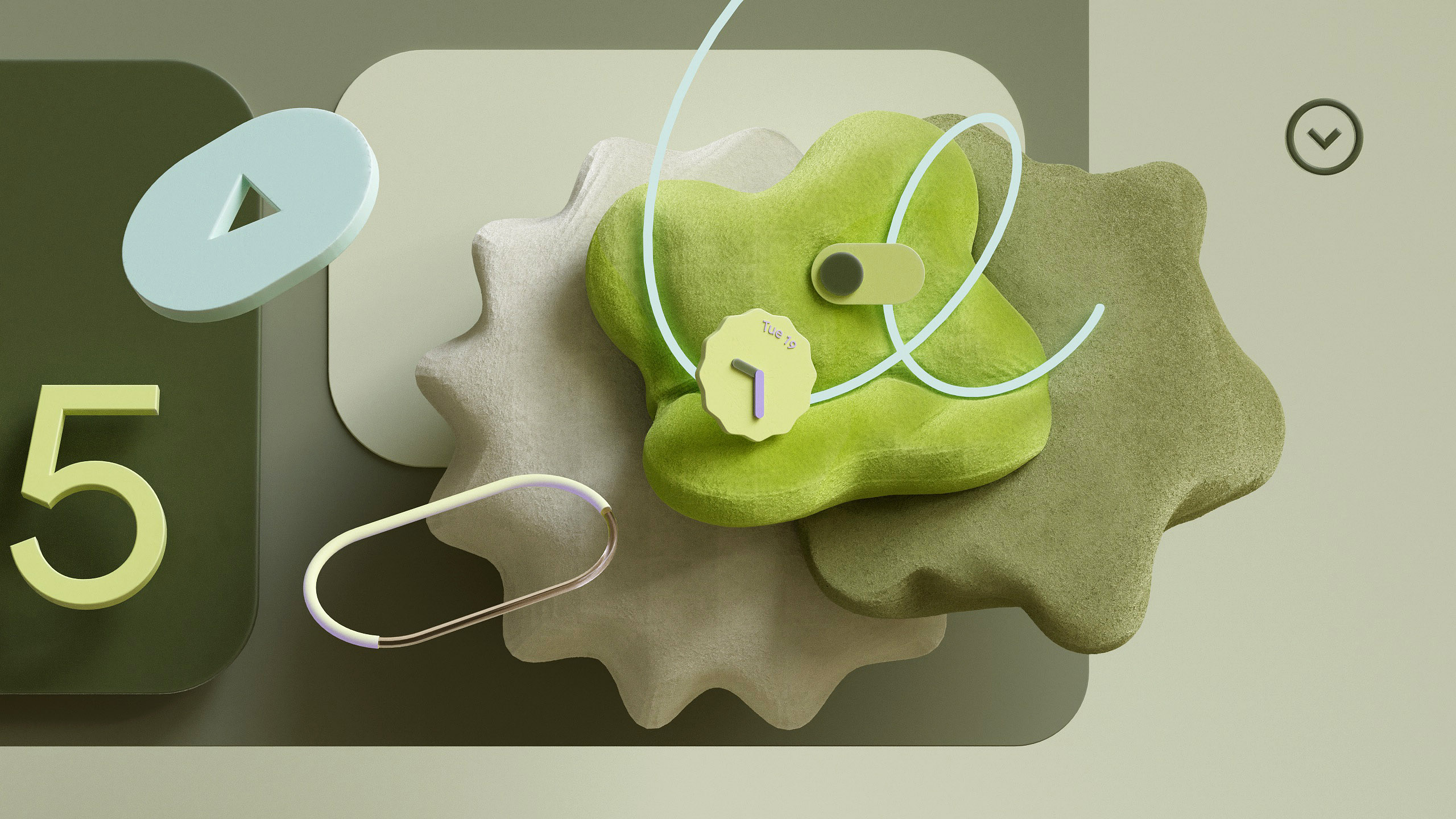
UX Parts: In an attempt to highlight the beauty of the “MaterialYou” designs, we created compositions that comprise of actual user interface elements, strapped from their functionality and context to purely focus on the beauty of its unique shape language.
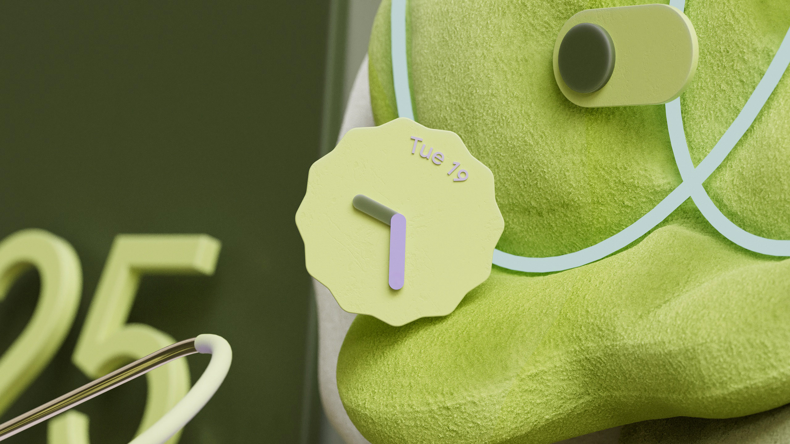
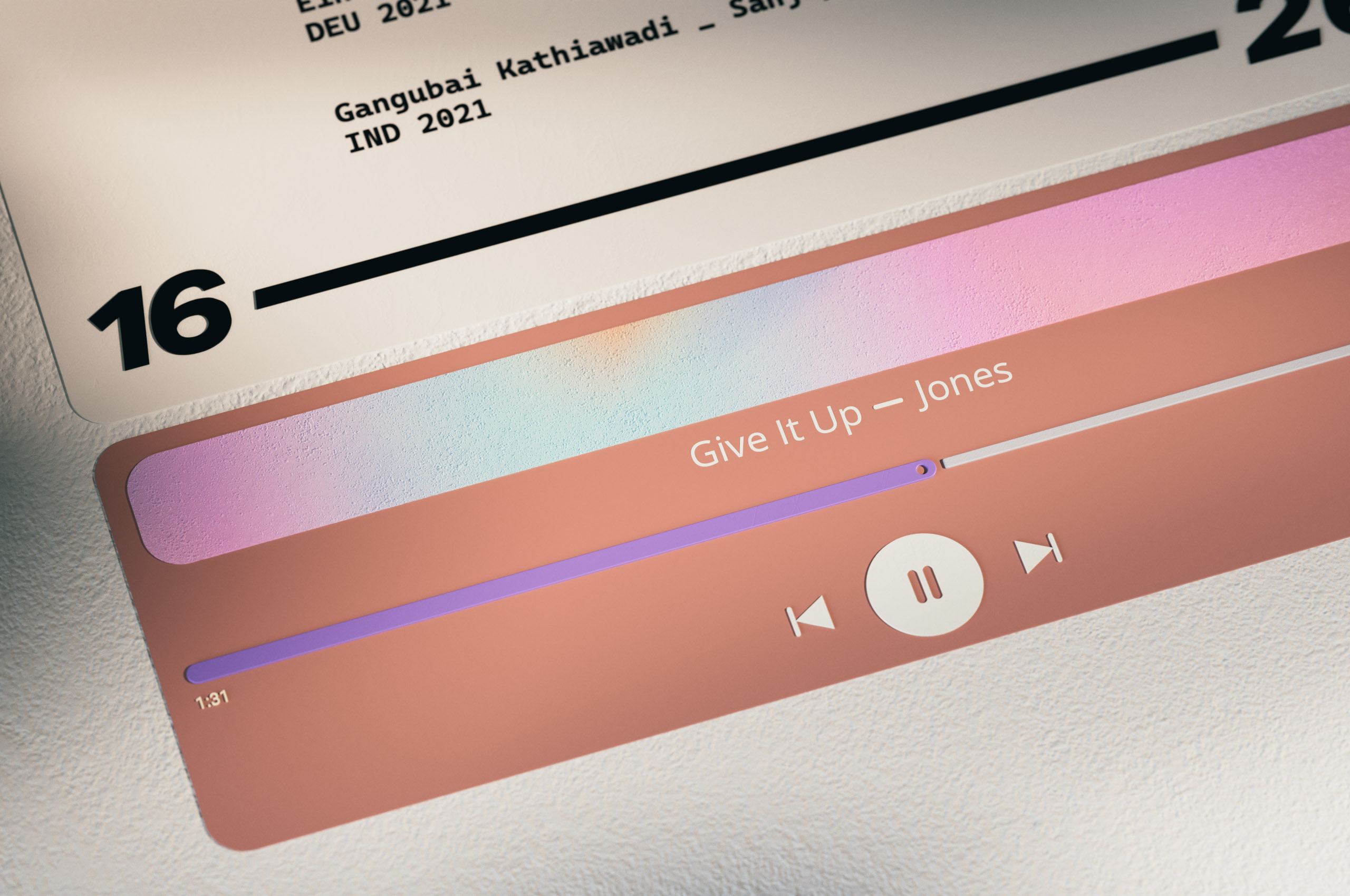
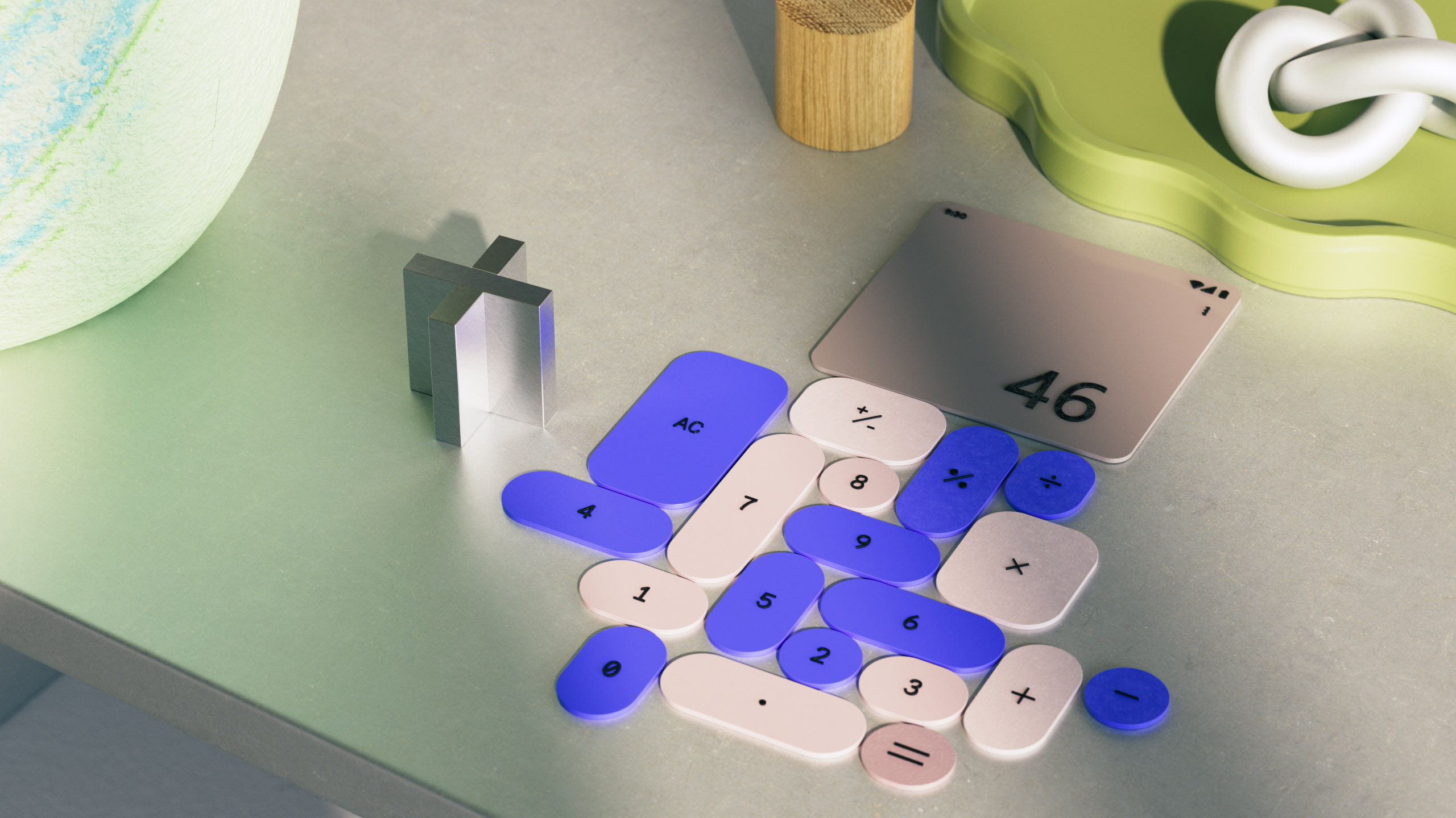
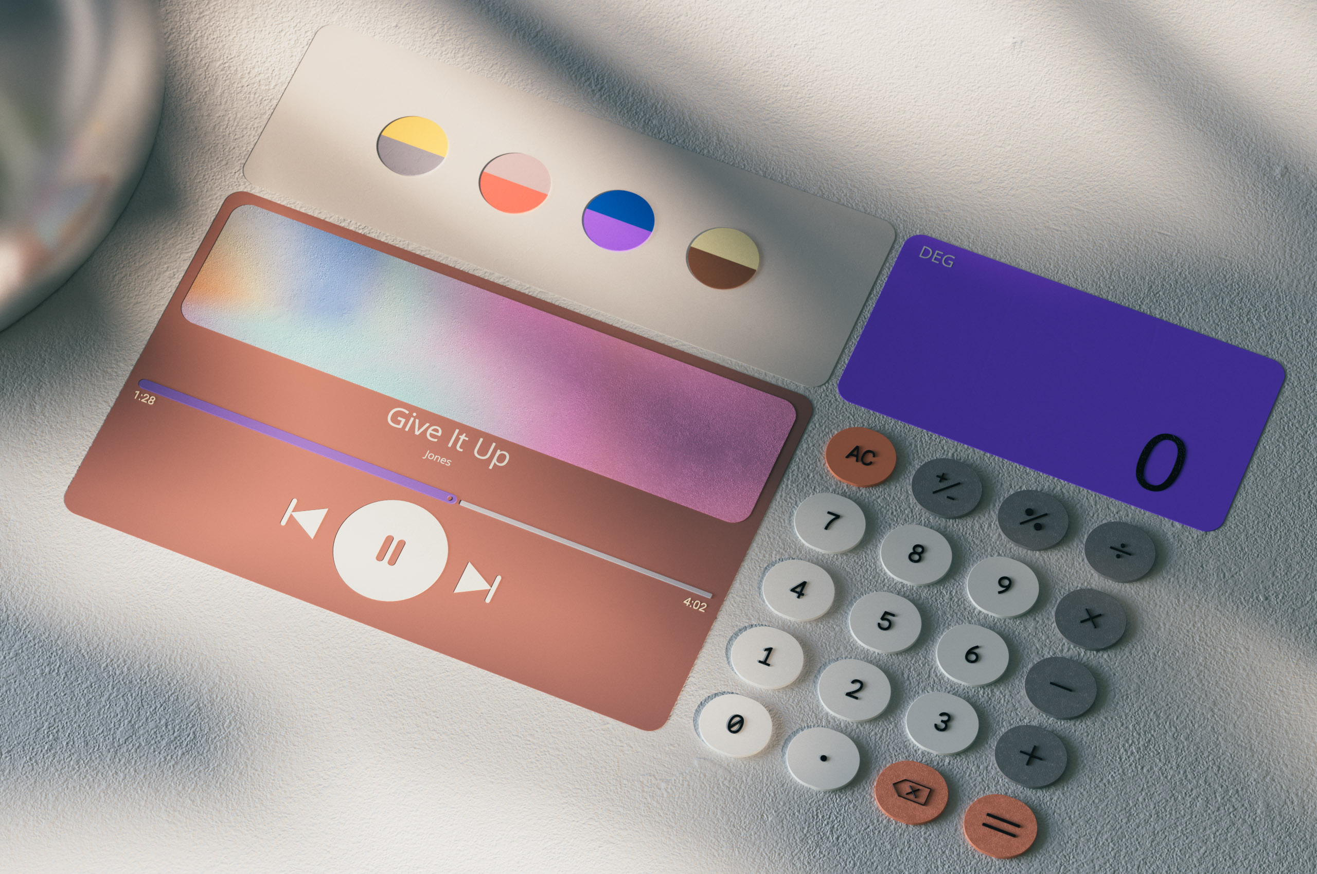
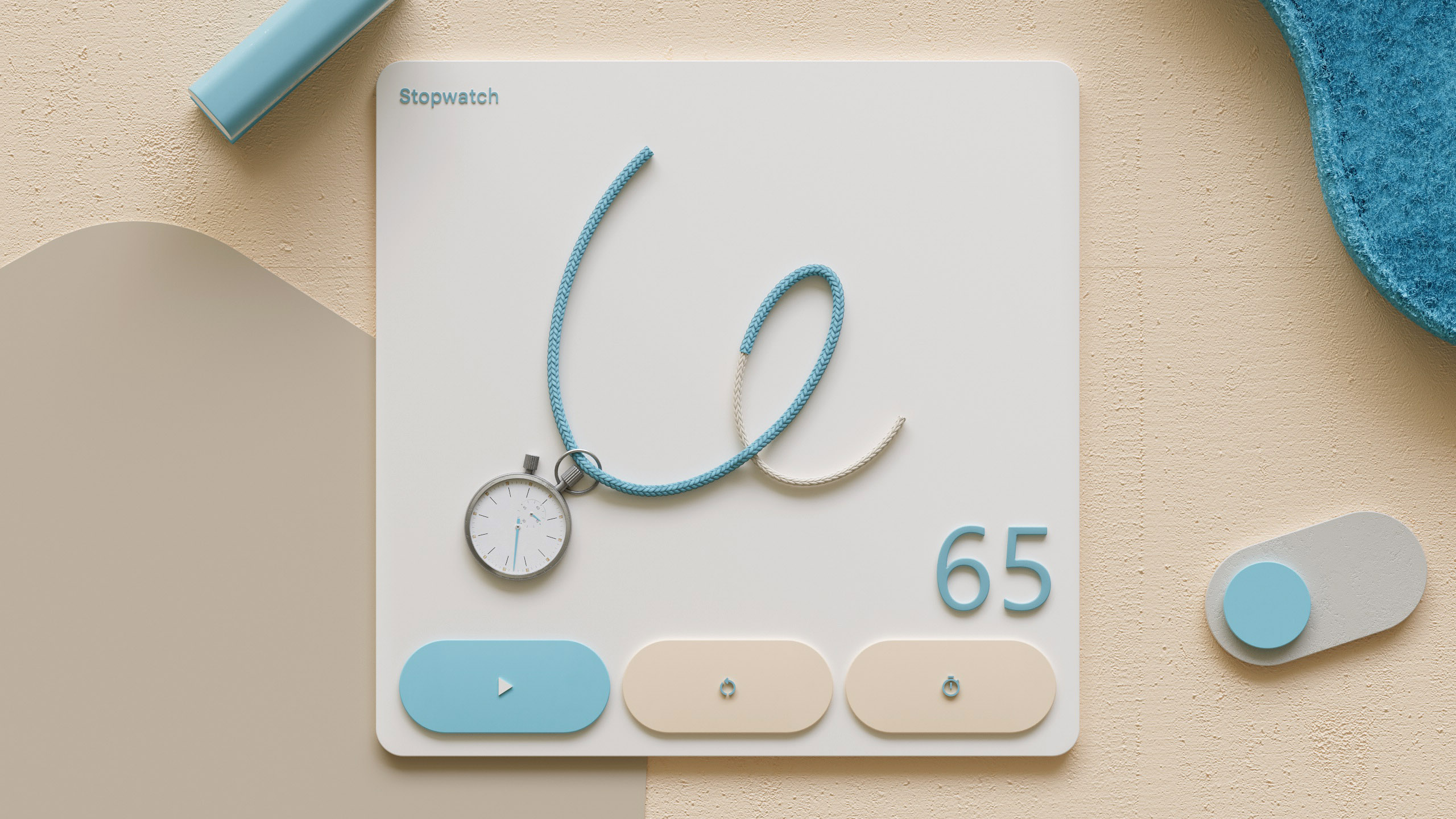
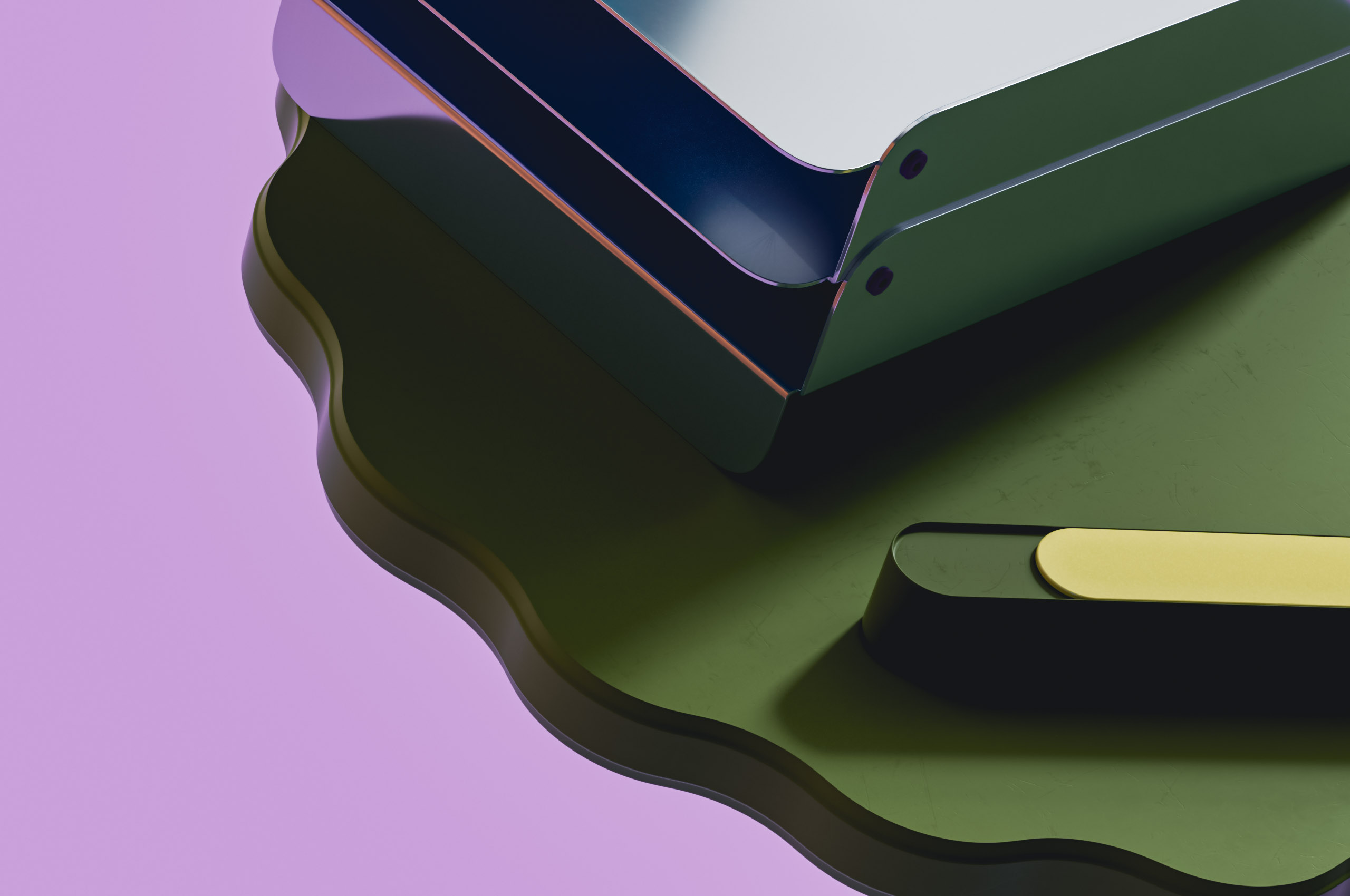
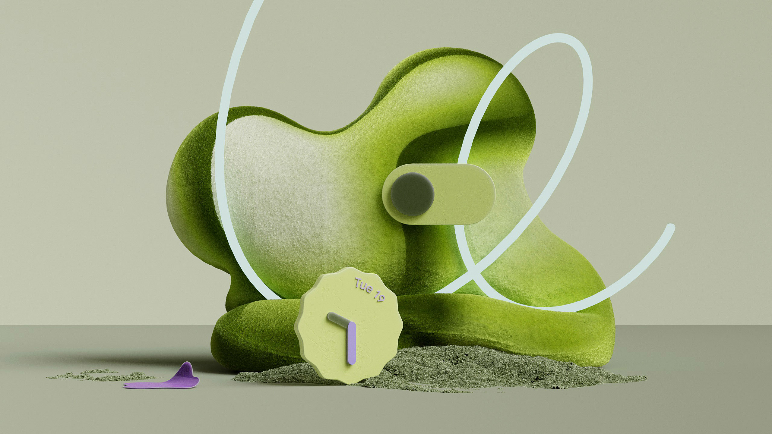
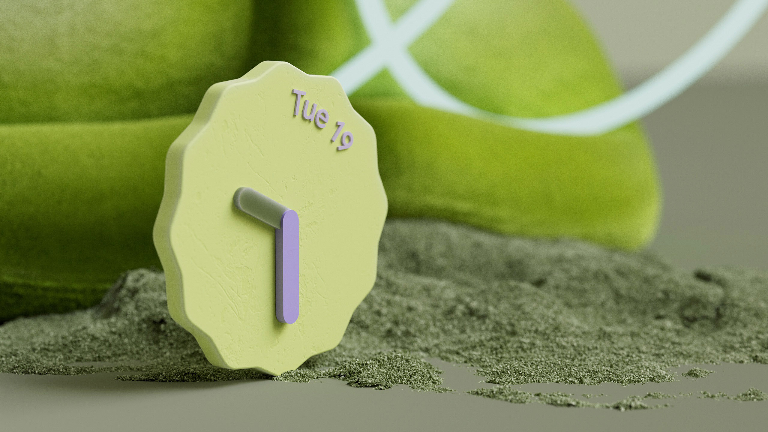
Material Essence: While presenting the full user interface, our designs are creative interpretations of its functionality. A calculator enjoying the variability of its own physical form; a stopwatch positioning itself within the stopwatch UI creating a hybrid between digital interface and physical object; an image carousel that moves the blinds in front of a window and many more.
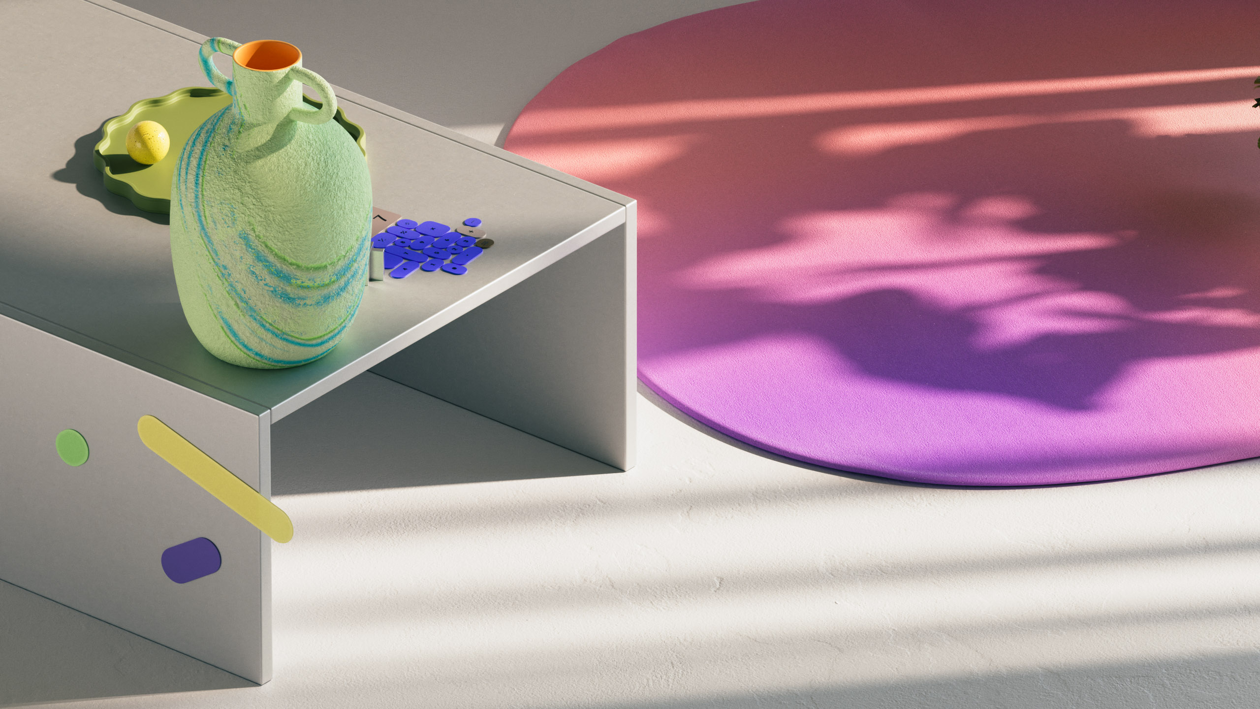
Suite of Experiences: The suite of experiences evolves around real-world scenarios, showing Google’s devices in realistic settings. Again, our focus on approachability resulted in the design of “ordinary” spaces that everyone can refer to - your kitchen at home, an inviting living room or a tasteful home office.
UX Parts: In an attempt to highlight the beauty of the “MaterialYou” designs, we created compositions that comprise of actual user interface elements, strapped from their functionality and context to purely focus on the beauty of its unique shape language.
Material Essence: While presenting the full user interface, our designs are creative interpretations of its functionality. A calculator enjoying the variability of its own physical form; a stopwatch positioning itself within the stopwatch UI creating a hybrid between digital interface and physical object; an image carousel that moves the blinds in front of a window and many more.
Suite of Experiences: The suite of experiences evolves around real-world scenarios, showing Google’s devices in realistic settings. Again, our focus on approachability resulted in the design of “ordinary” spaces that everyone can refer to - your kitchen at home, an inviting living room or a tasteful home office.
【hero animation】
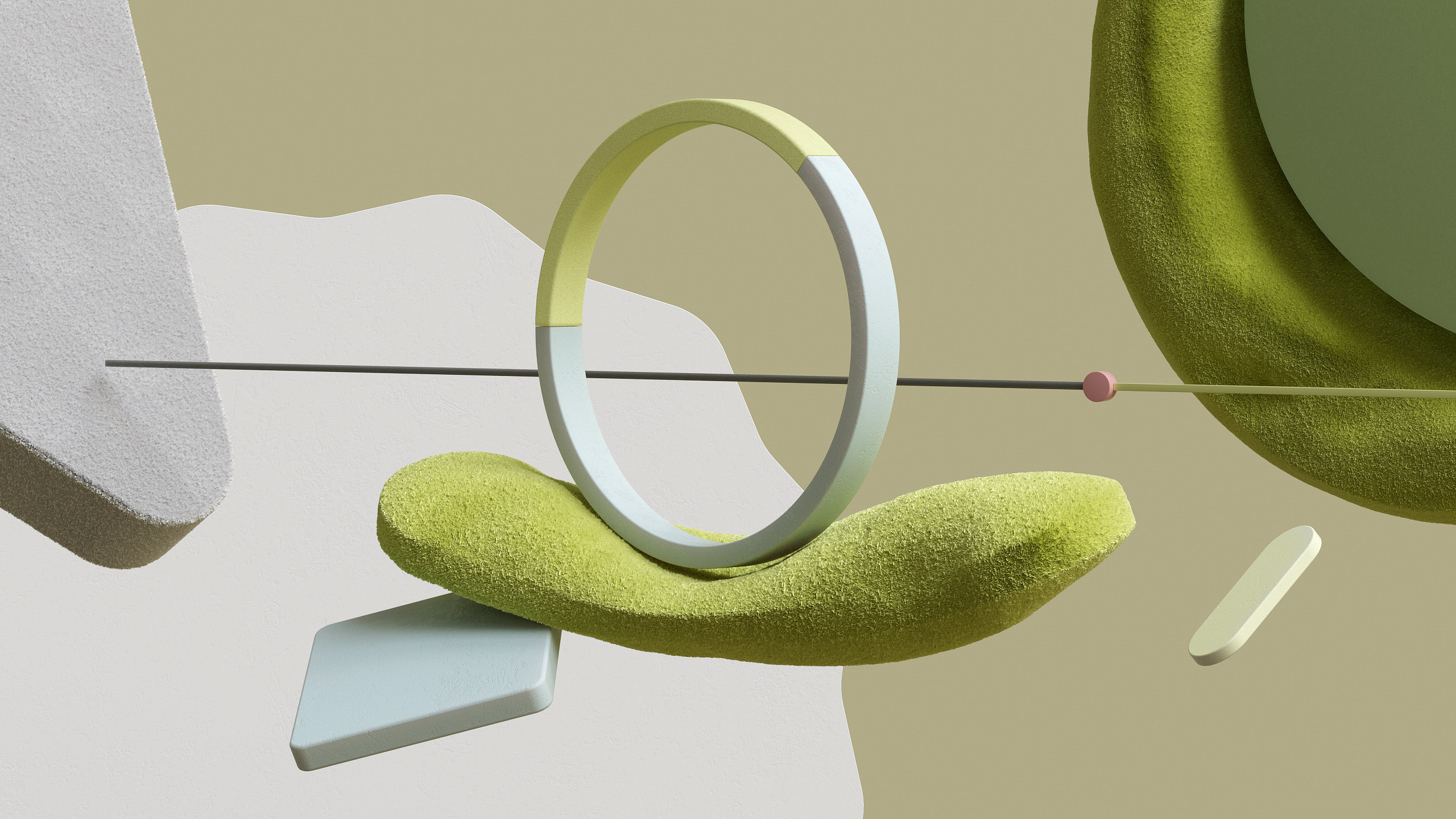
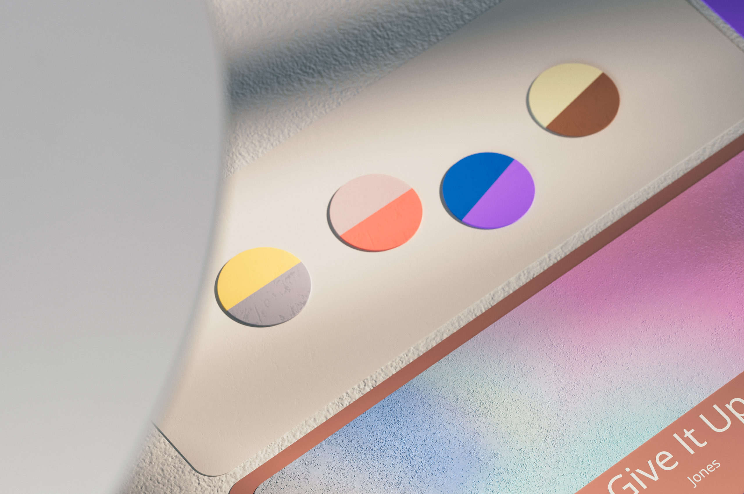
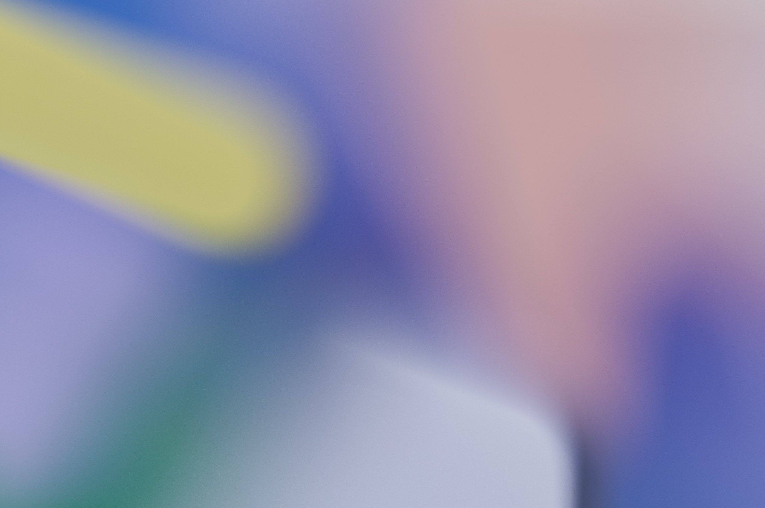
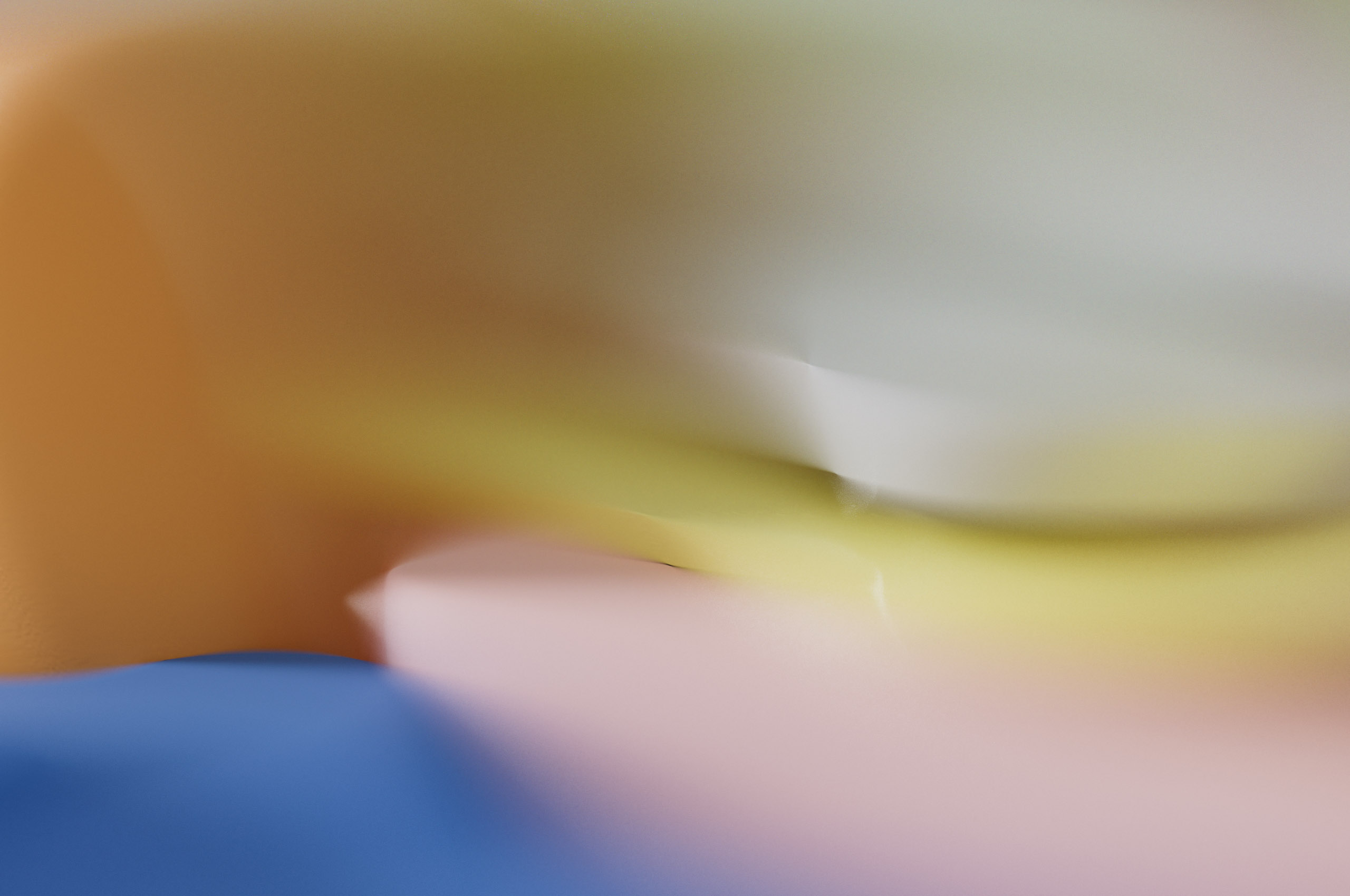
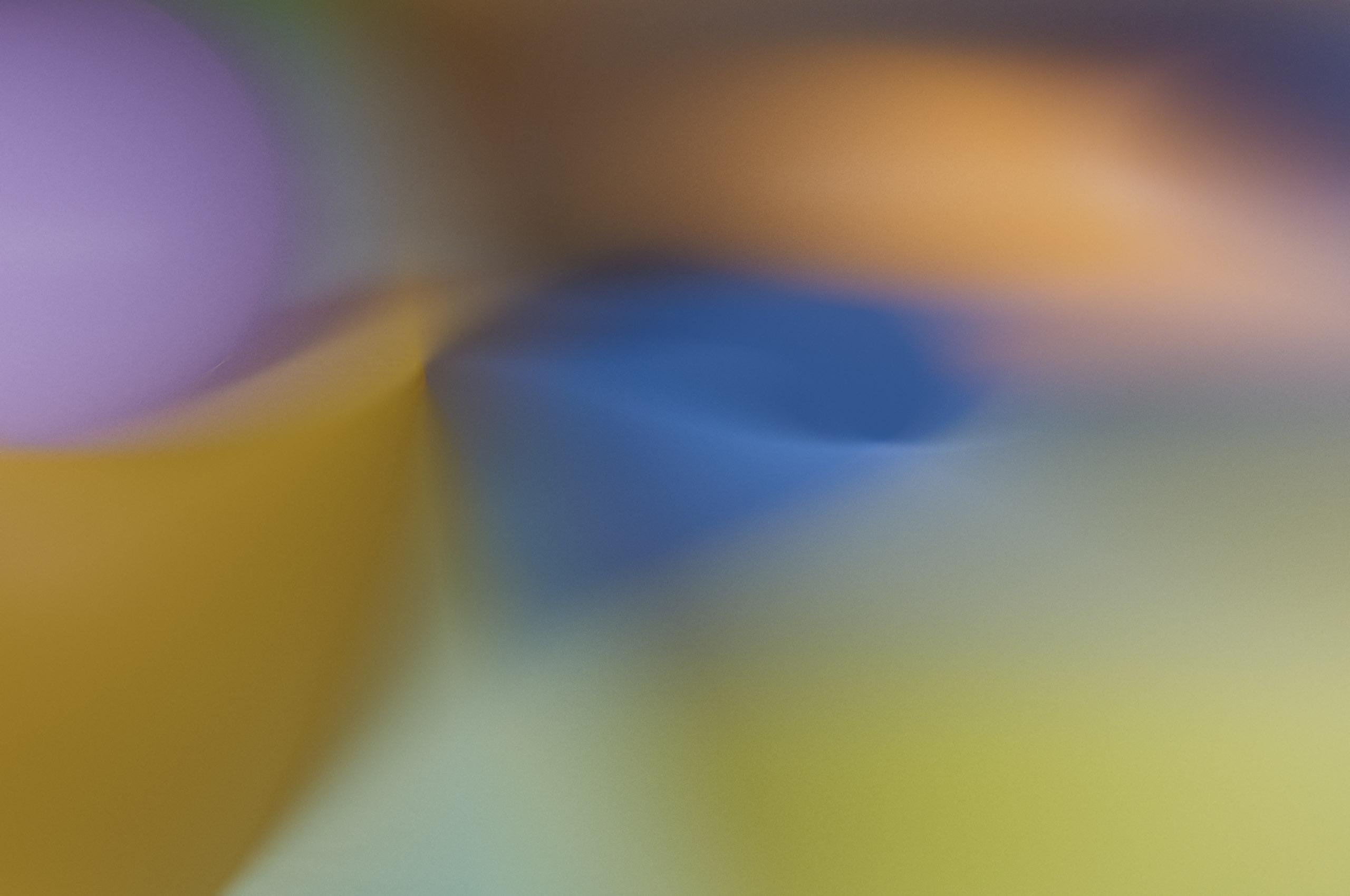
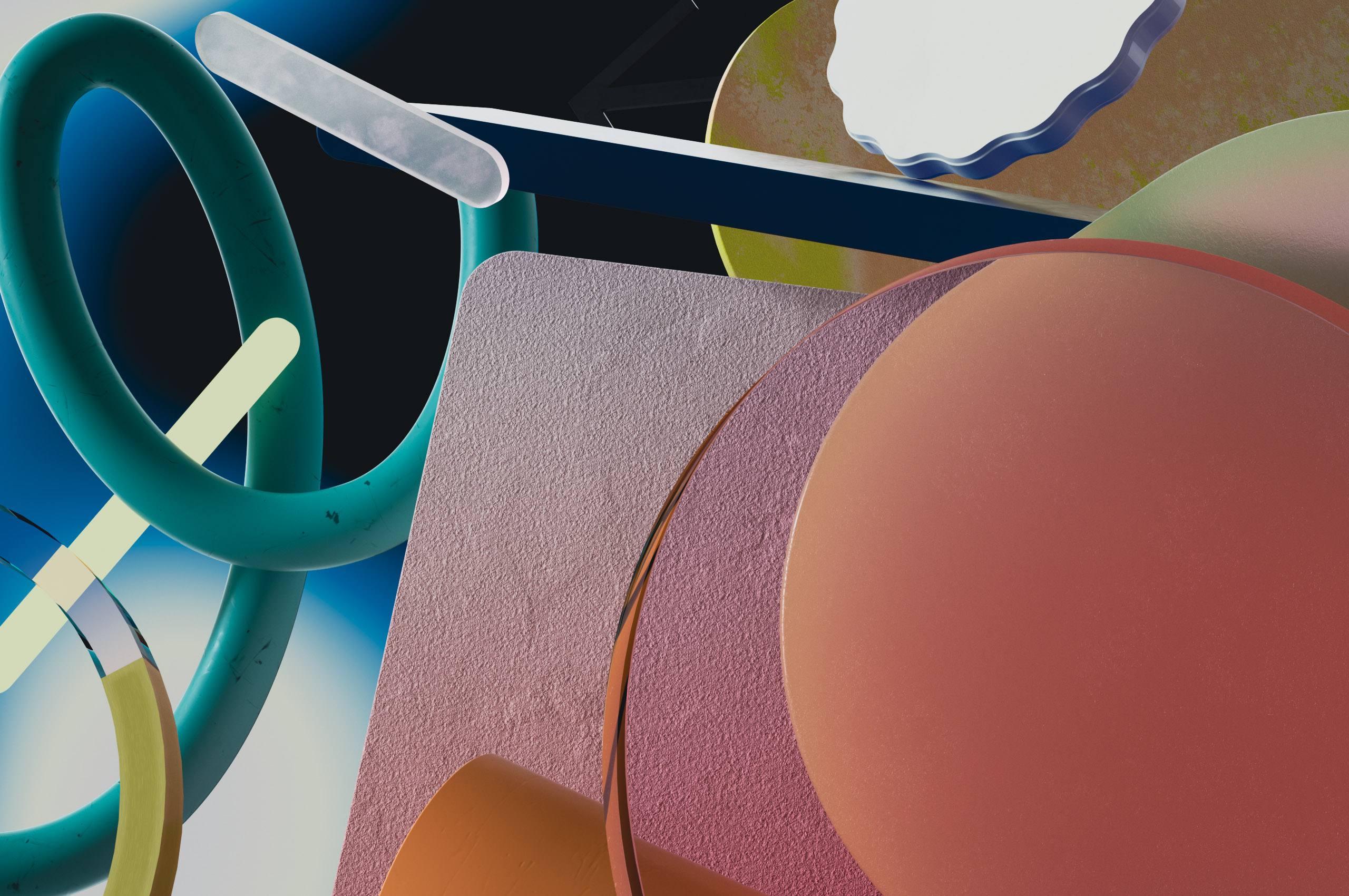
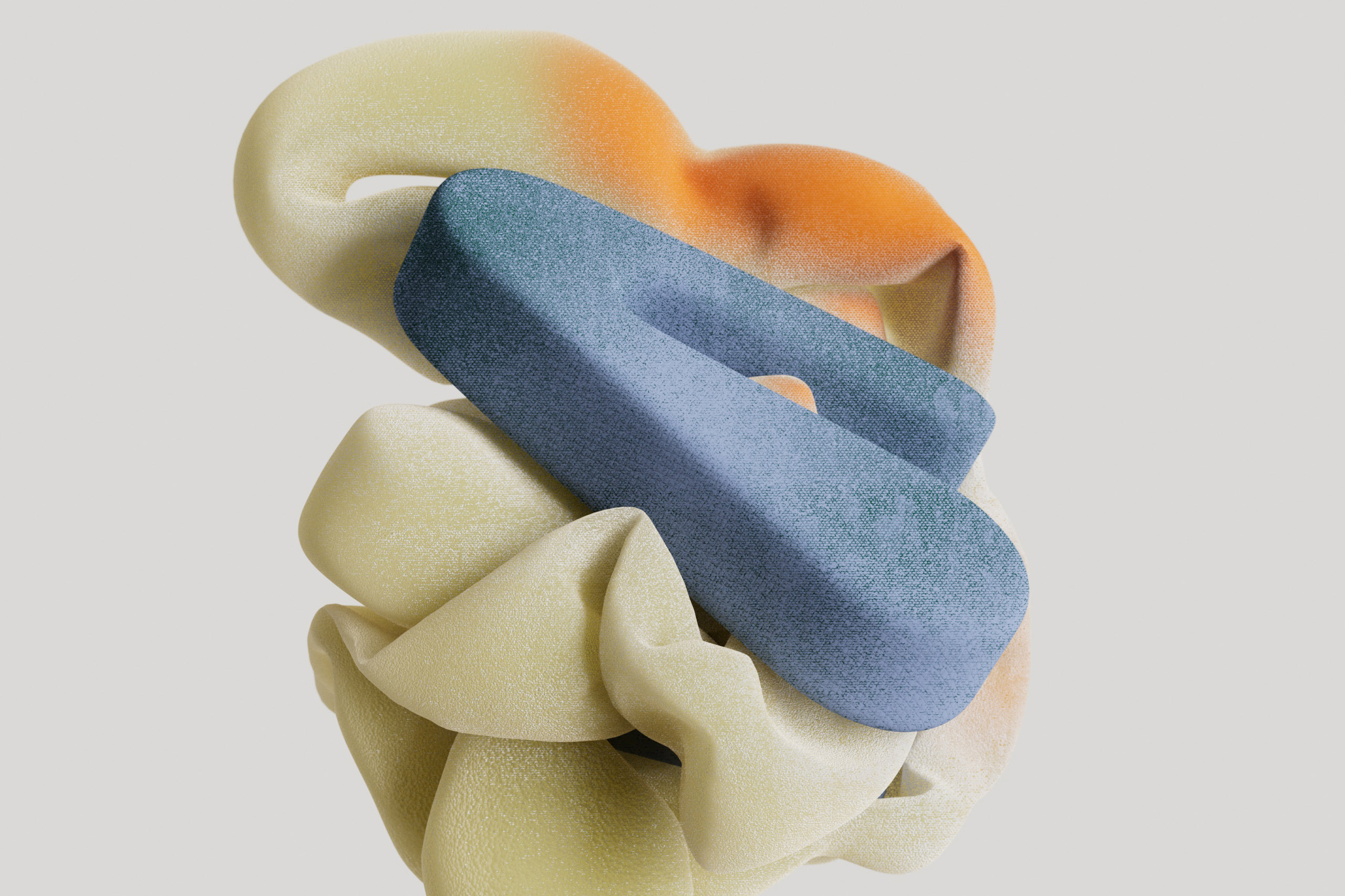
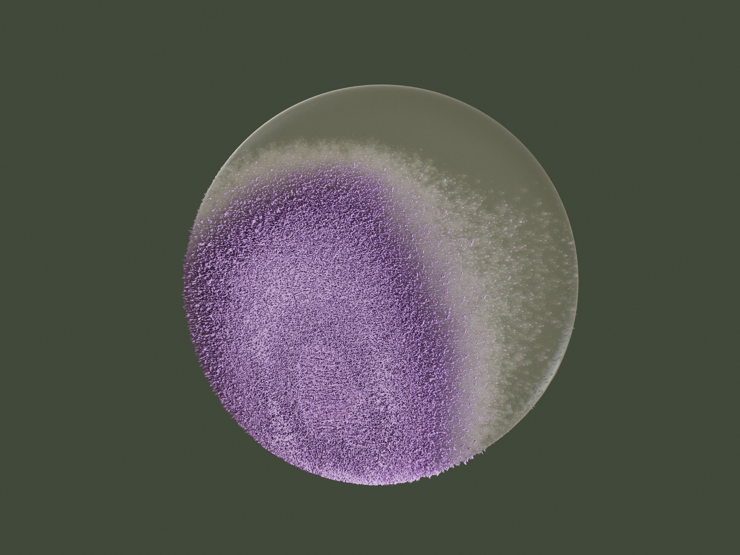
【atomic unit】
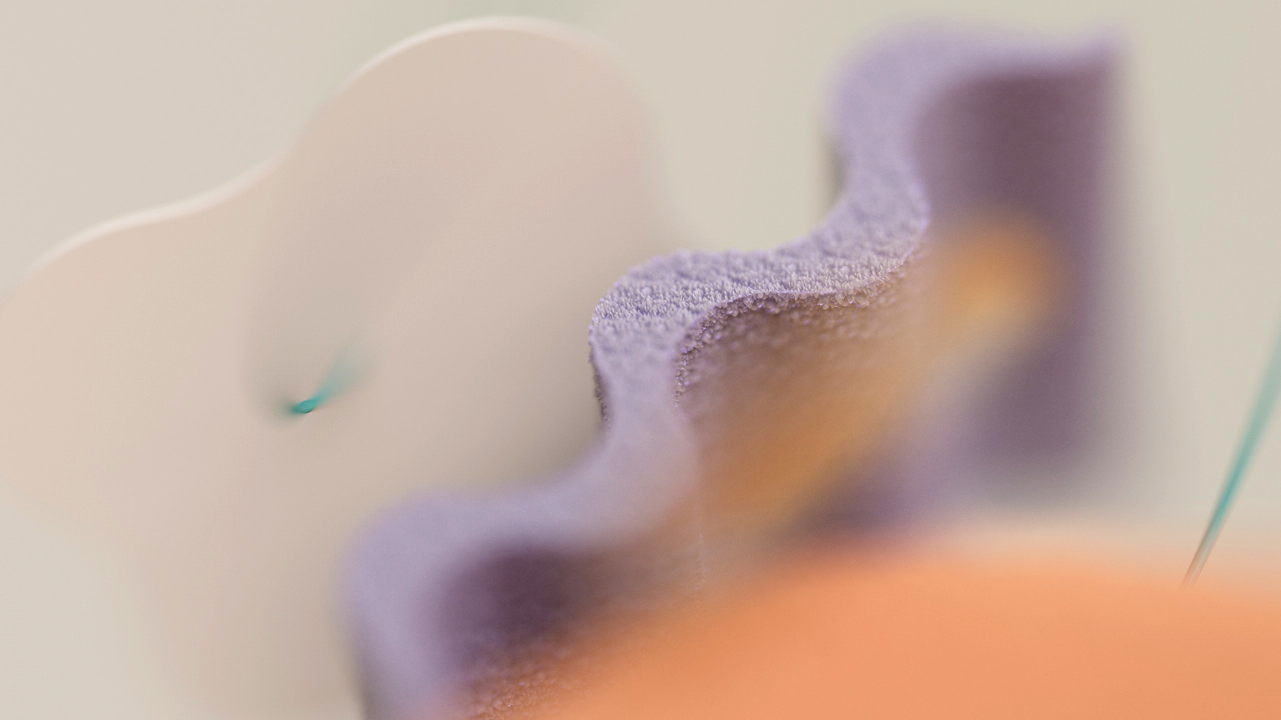
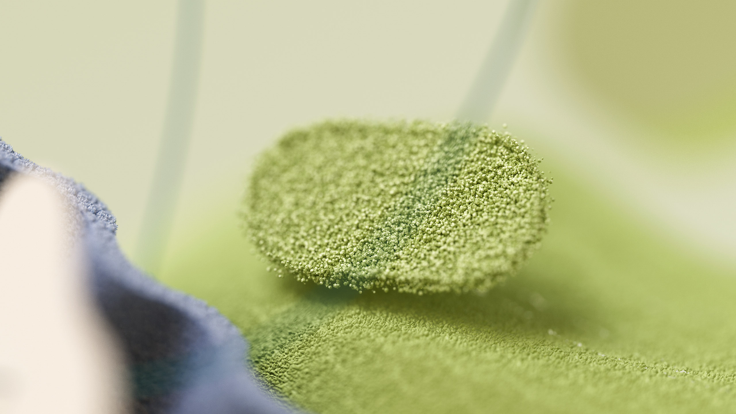
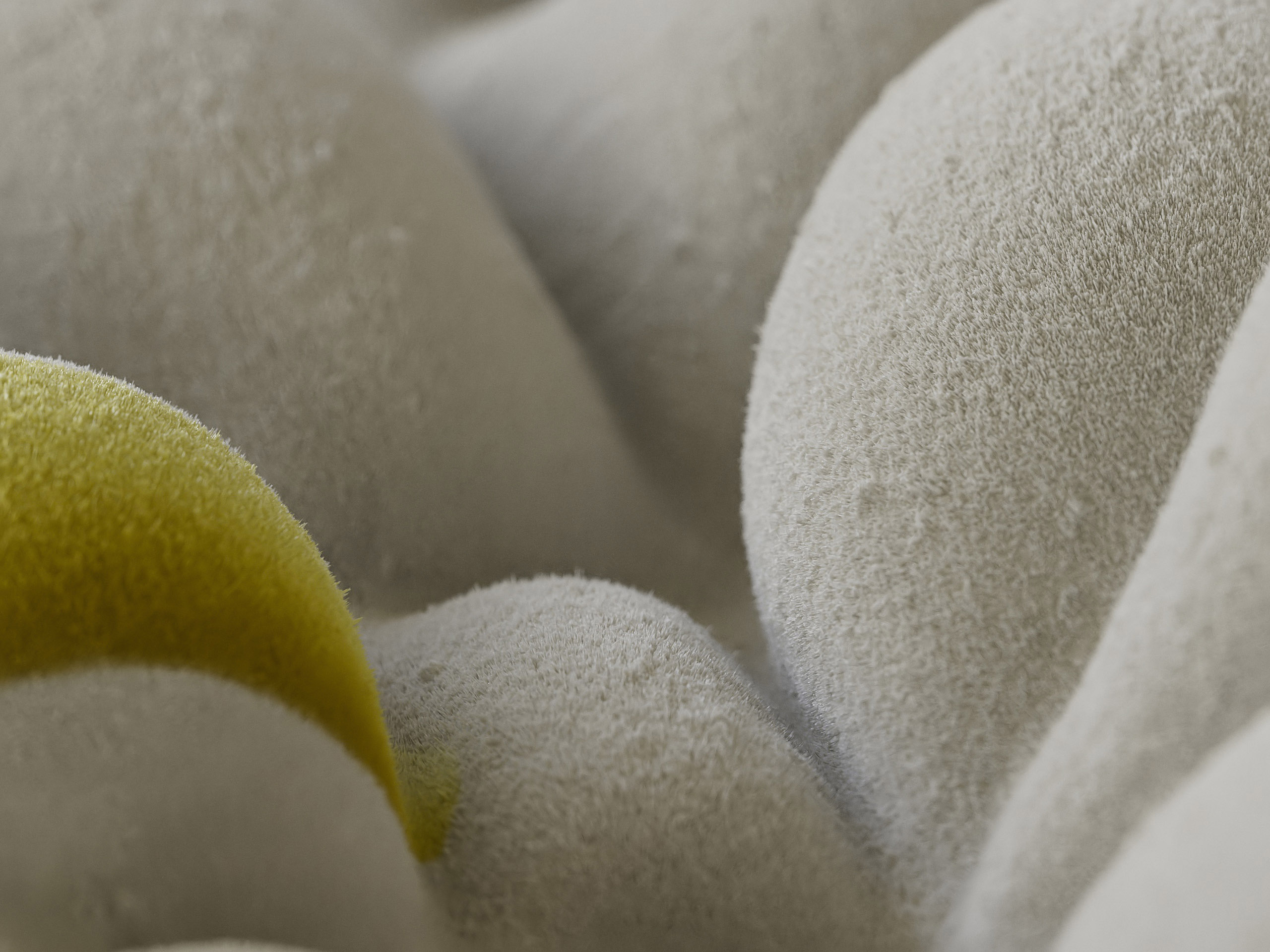
The world of the “Atomic Unit” is purely abstract, it consists of colors, gradients and particles with almost no reference to the user interface. The scale is macro and compositions predominantly close up. The atomic unit defines the smallest unit of our design system and thereby plays with the idea of giving an abstract digital world a physical limitation. Everything is based on this smallest unit, but we can never go beyond it.
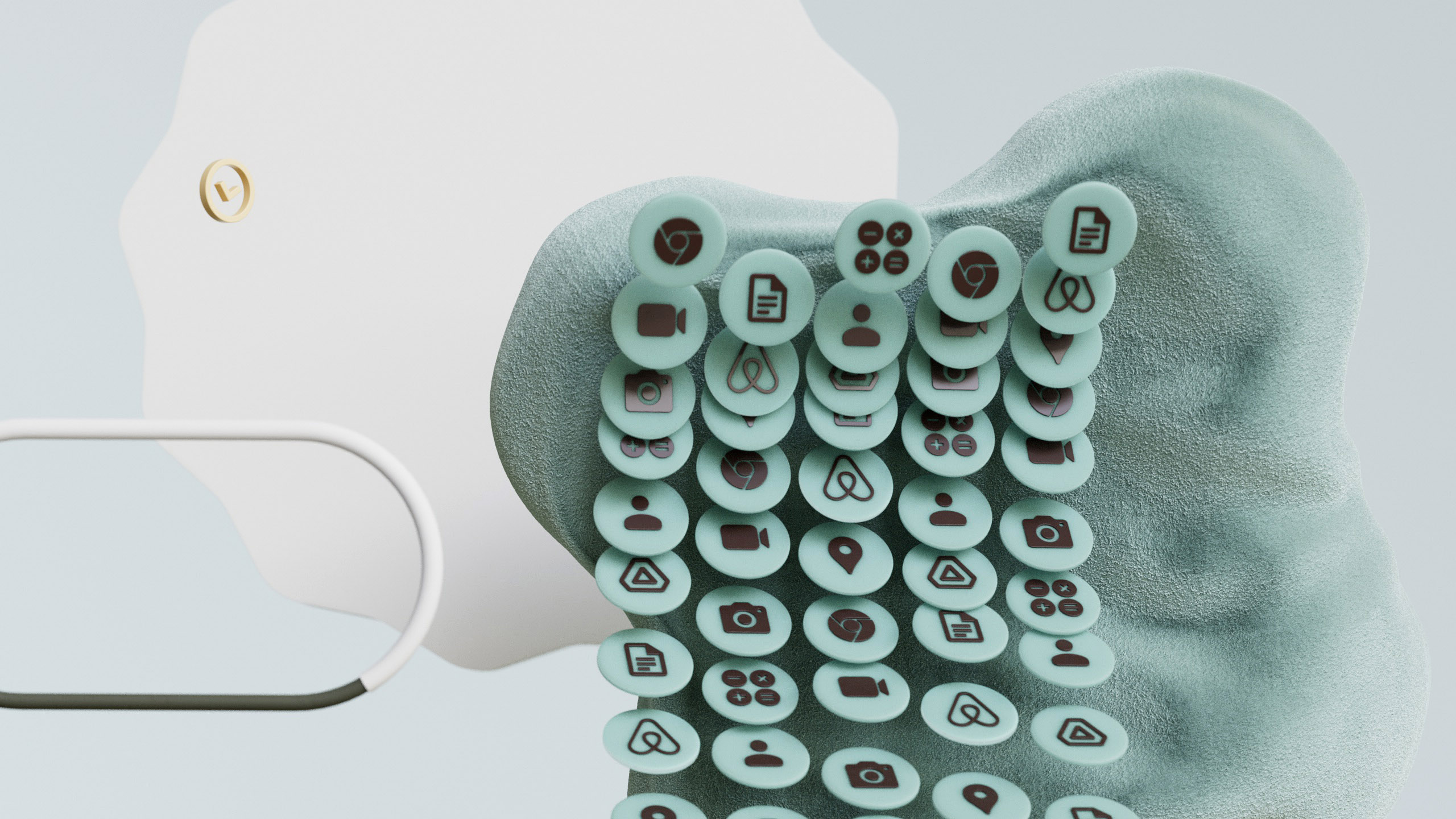
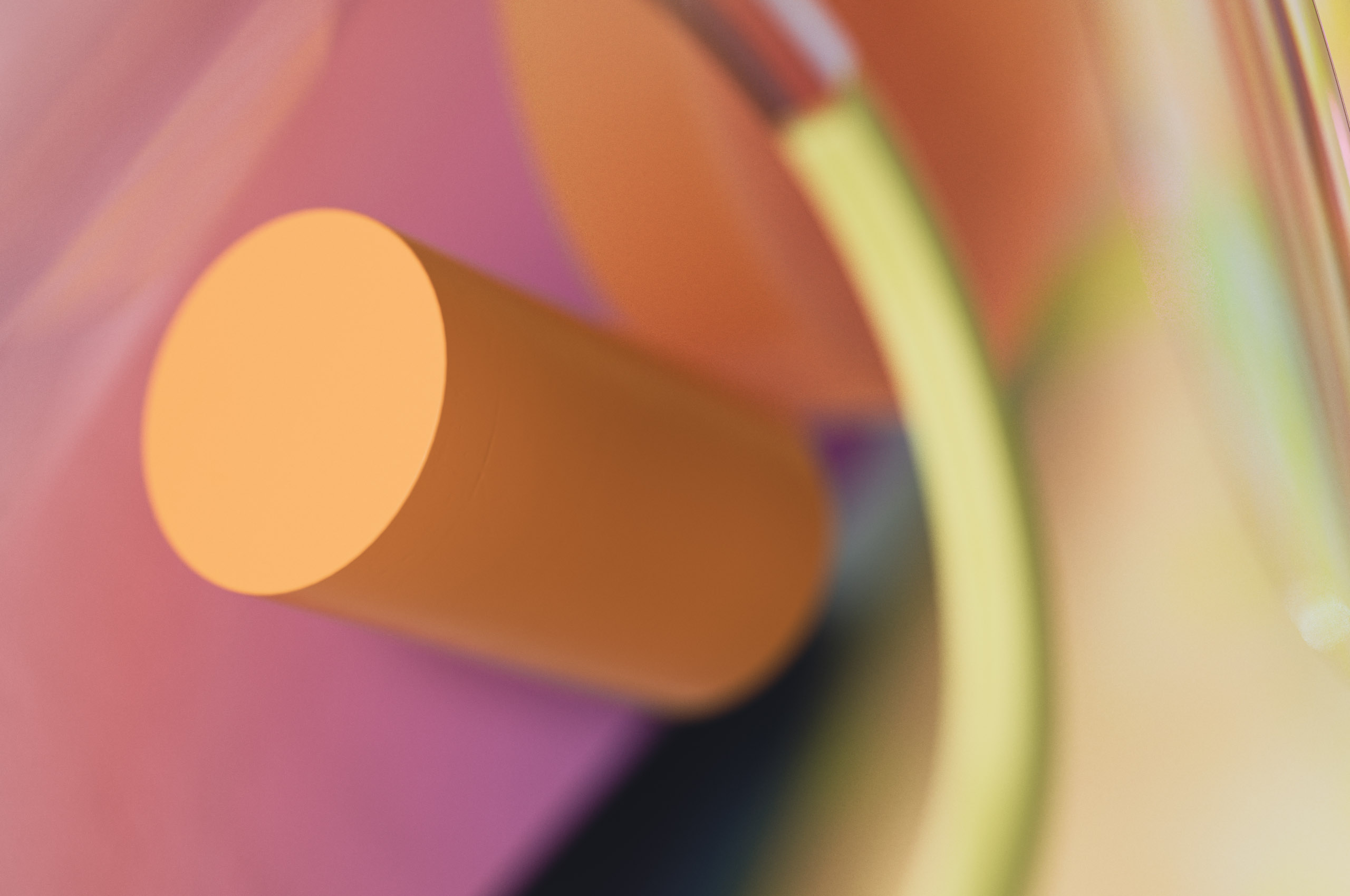
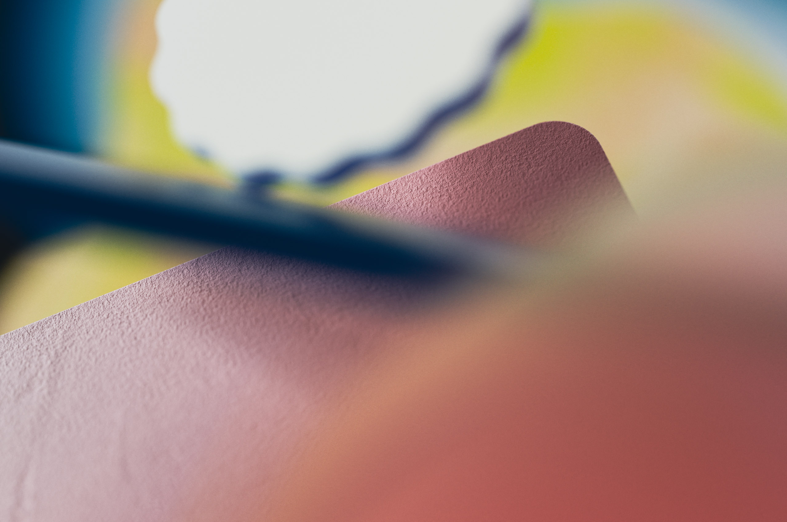
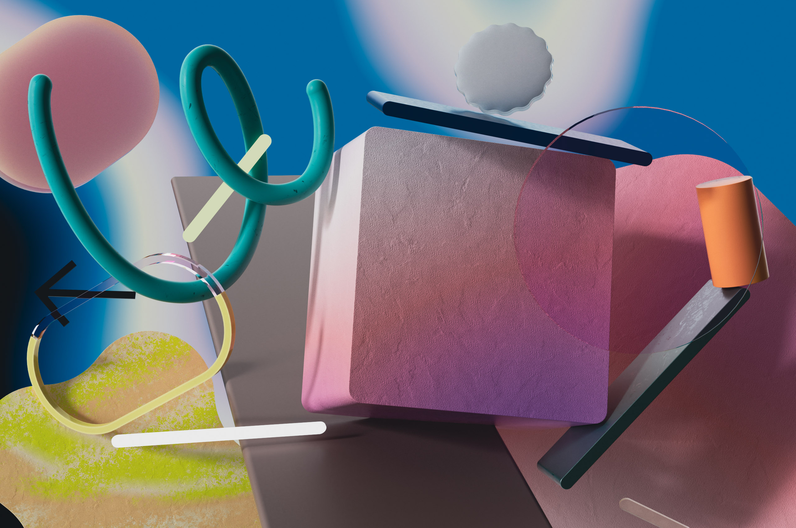
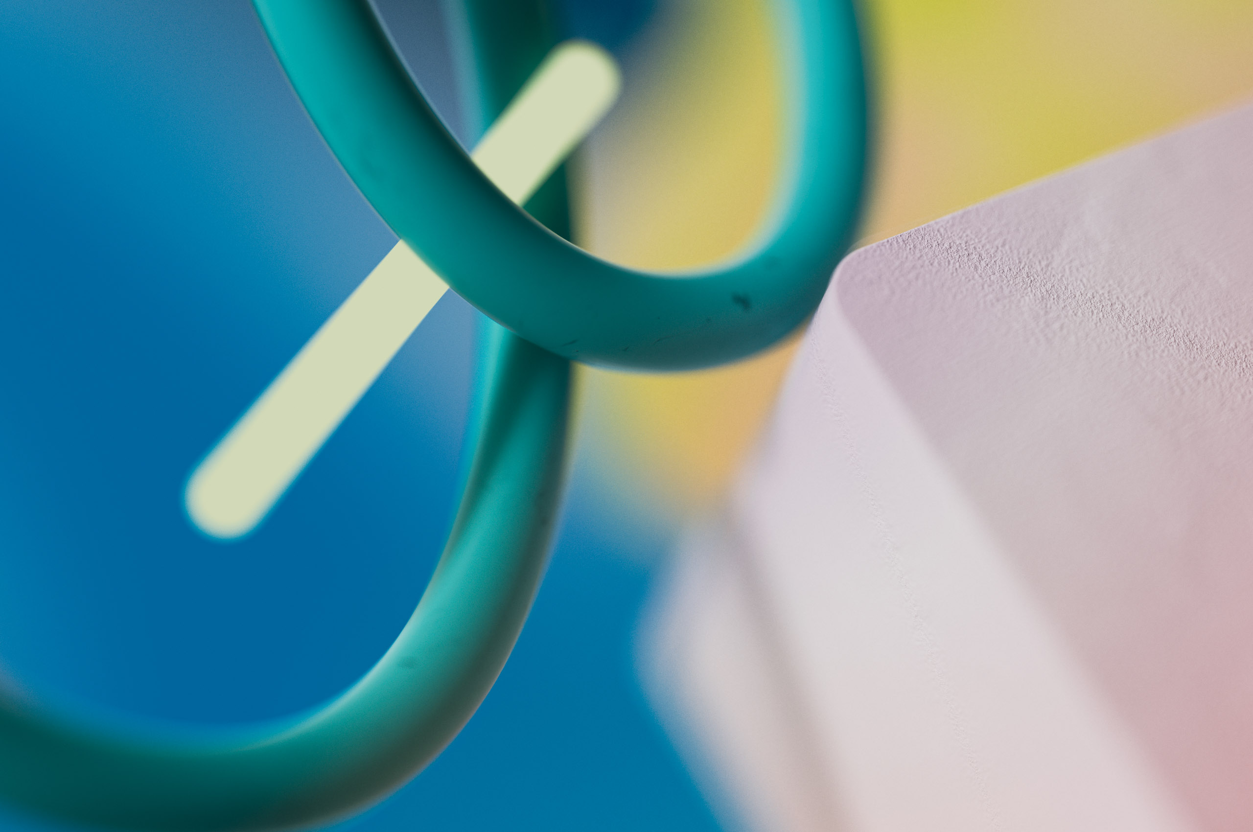
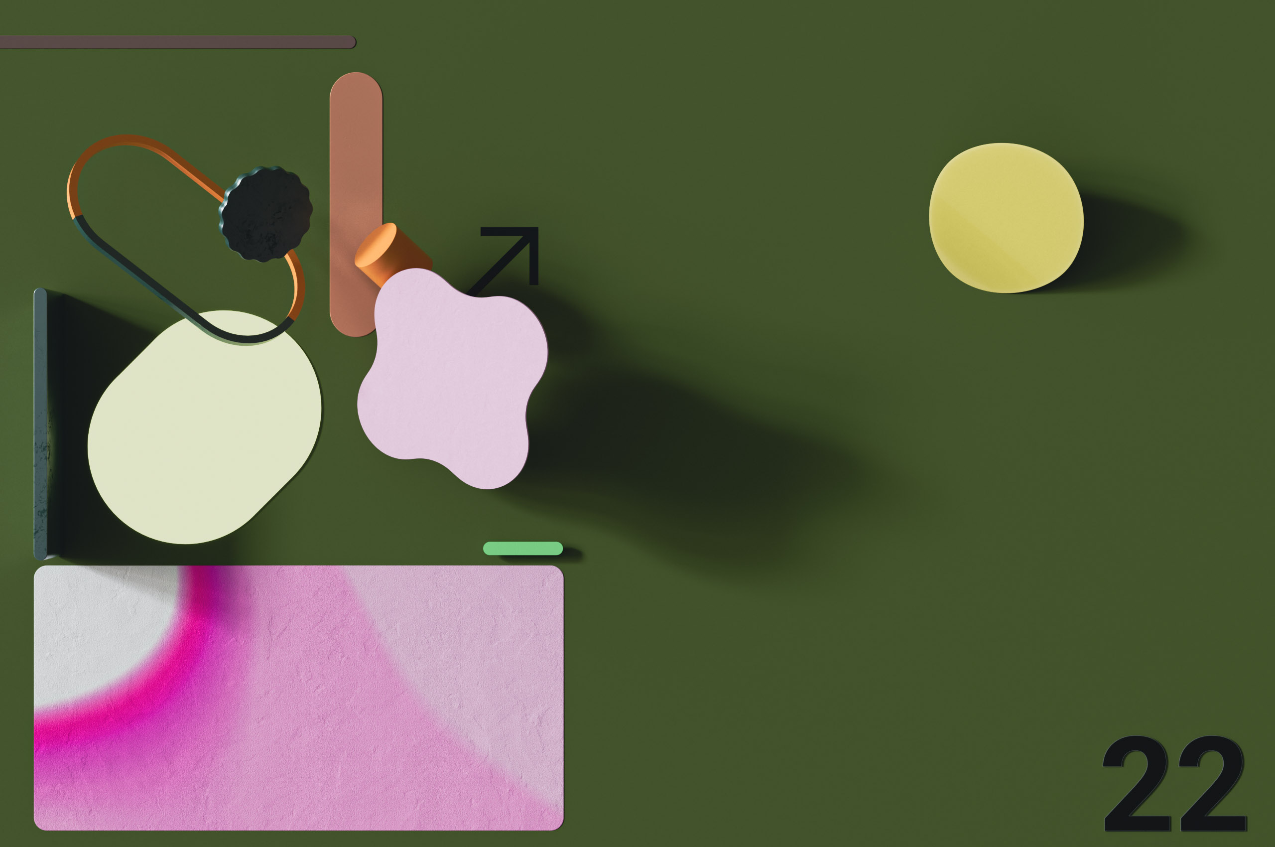
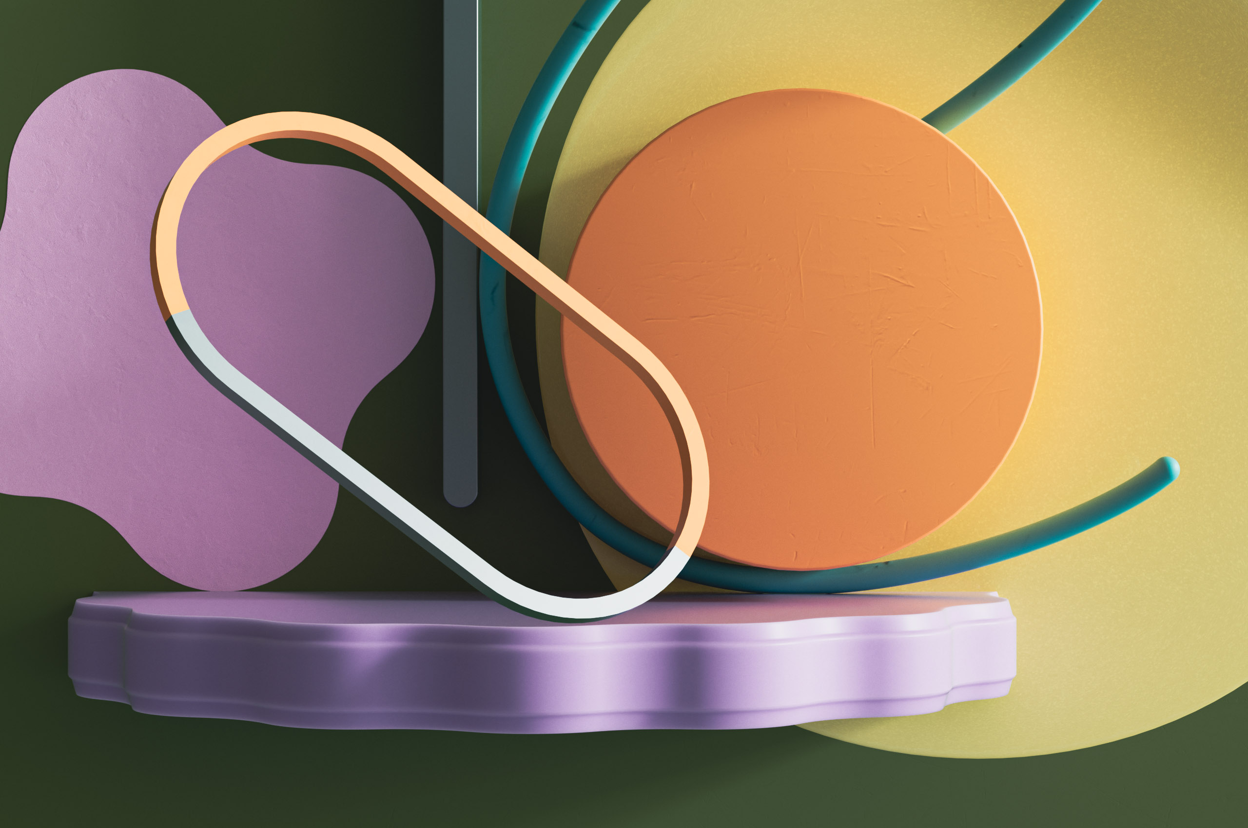
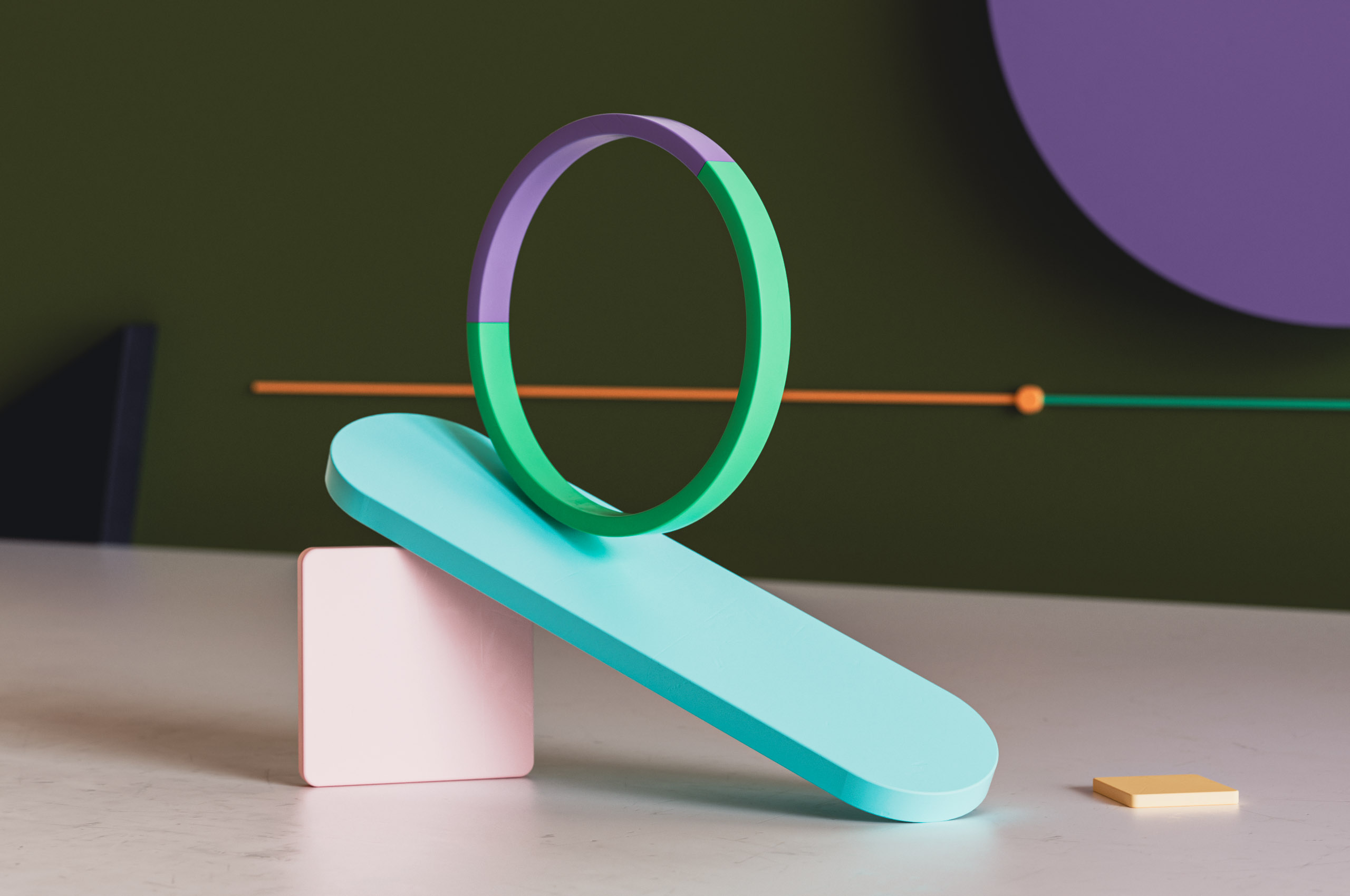
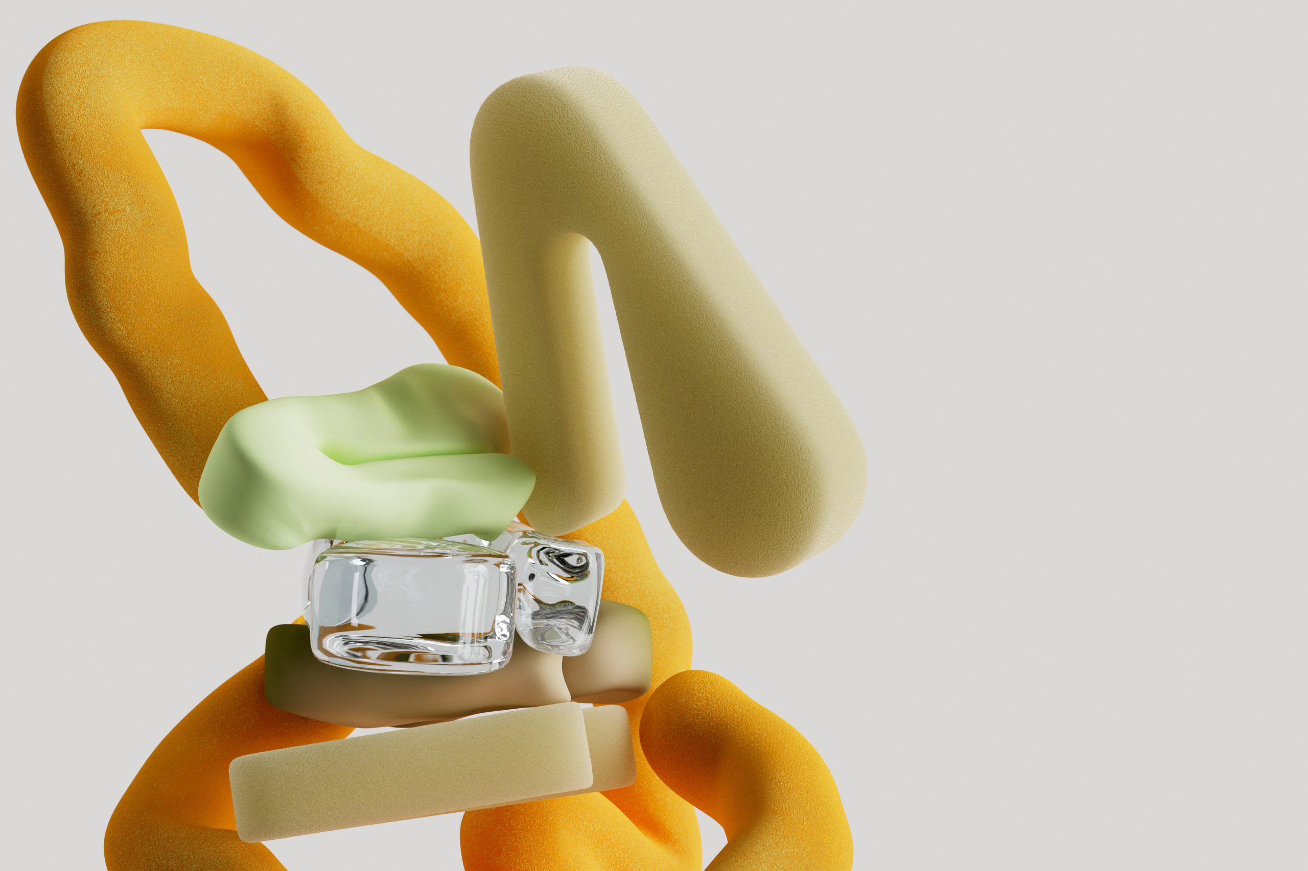
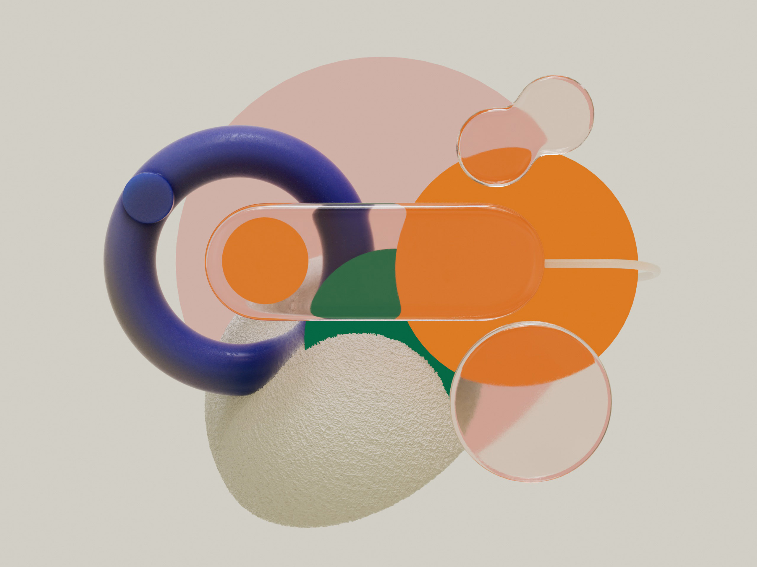
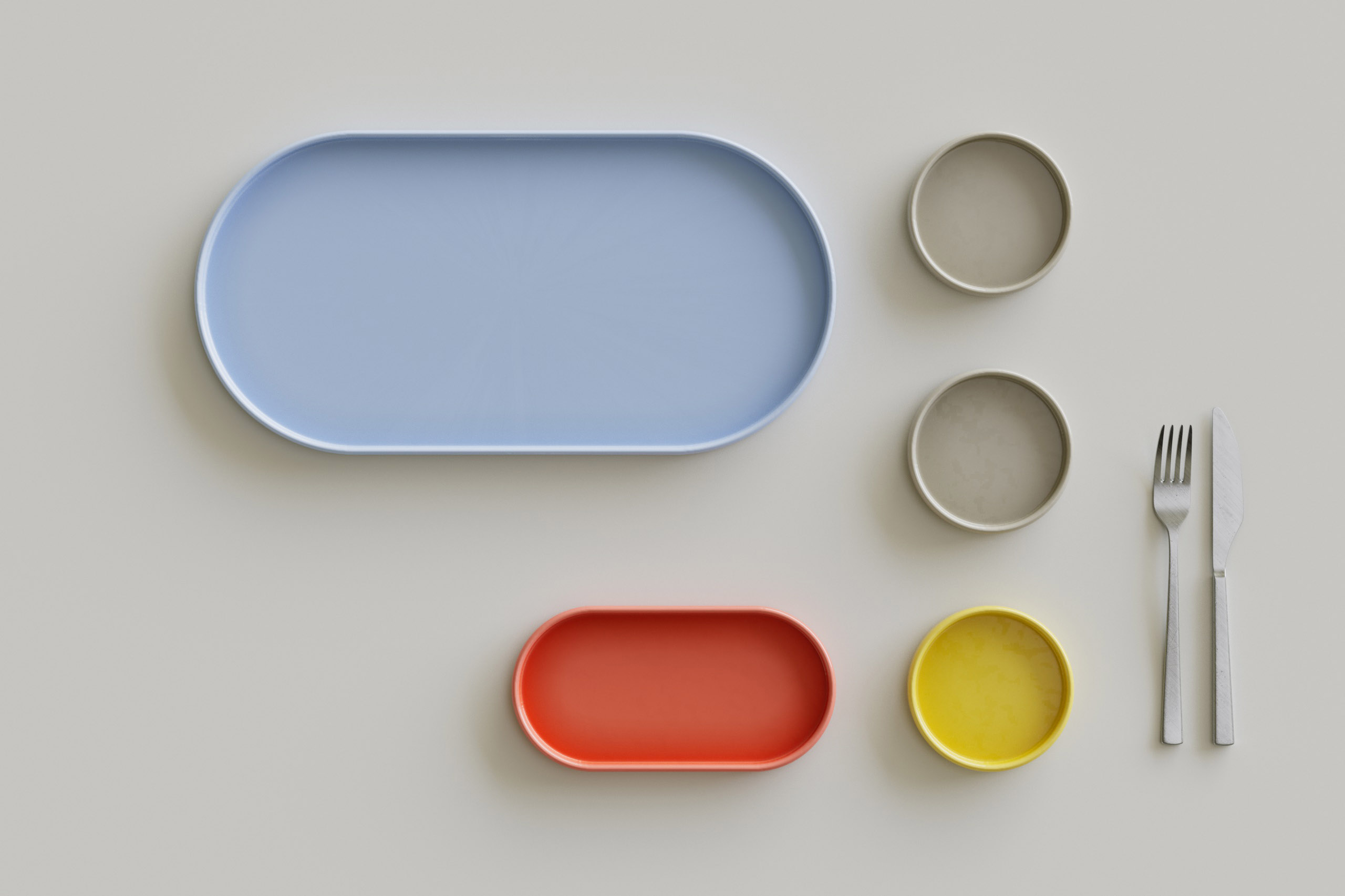
【UX parts】
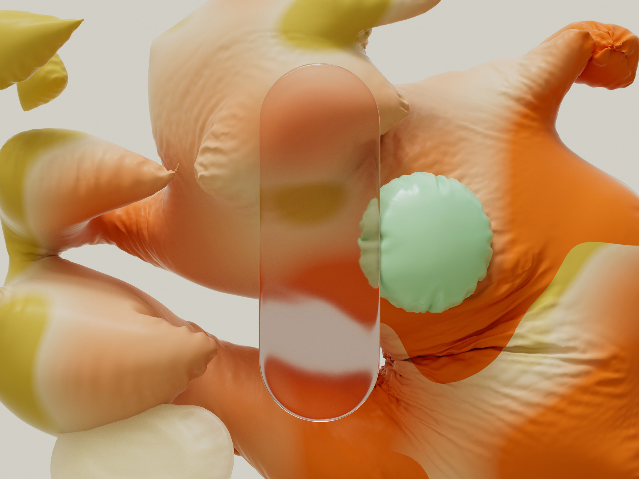
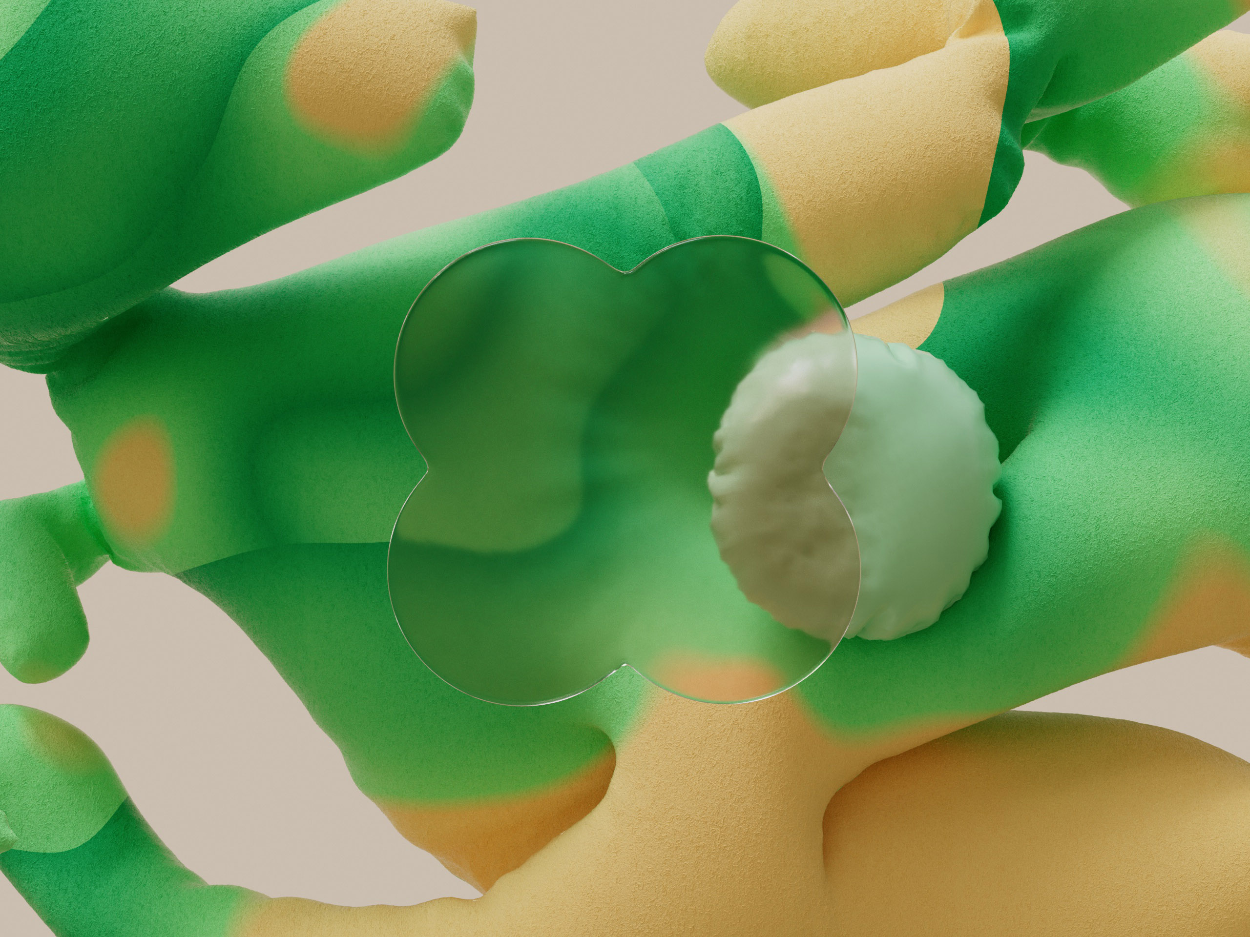
“UX Parts” focuses on individual pieces of the user interface. We intended to emphasize the distinct shape language that defines “MaterialYou” and wanted to celebrate its unique beauty.
Playful arrangements of abstract objects create compositions that are floaty with little to no spatial context. The materiality is abstract, but the light semi-realistic with shadowing between the objects.
The flat shading, organic shape language and soft materiality convey an inviting and approachable aesthetic, while the warm directional lighting suggests a realistic and inviting environment.


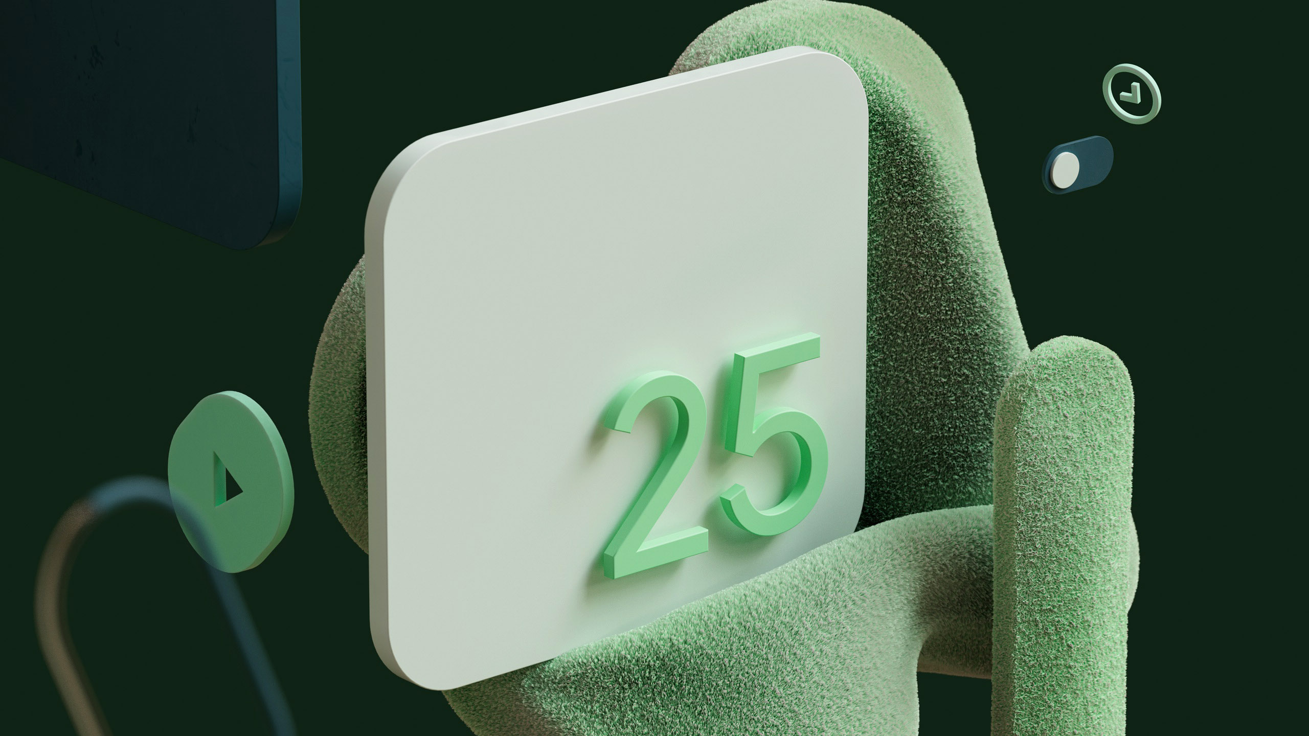


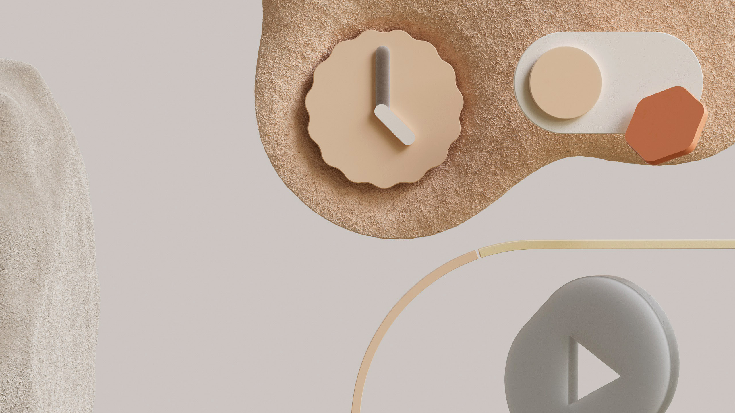
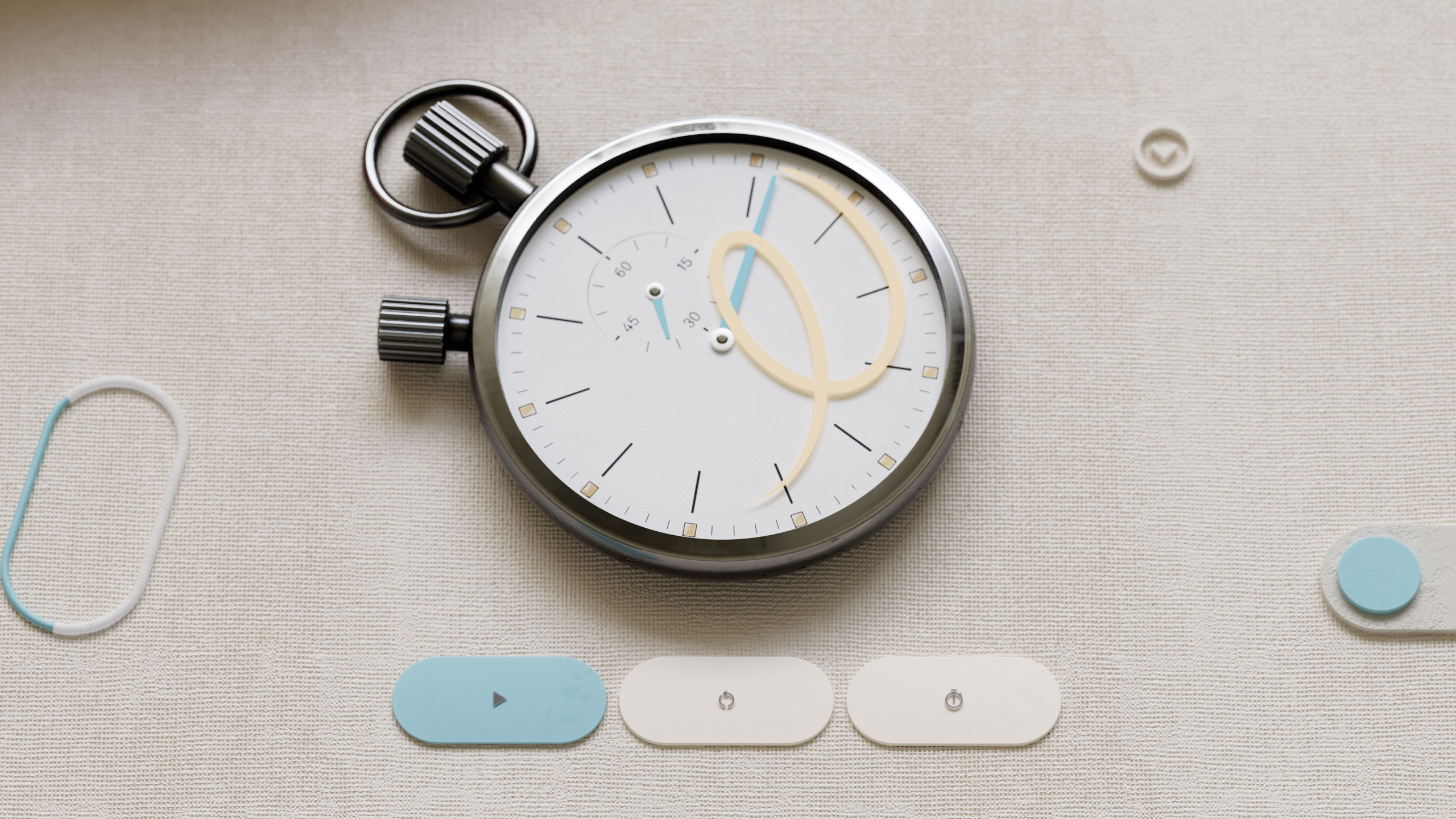
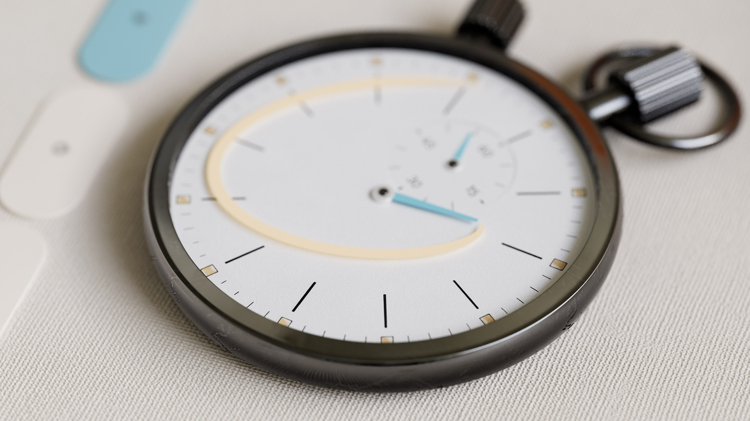
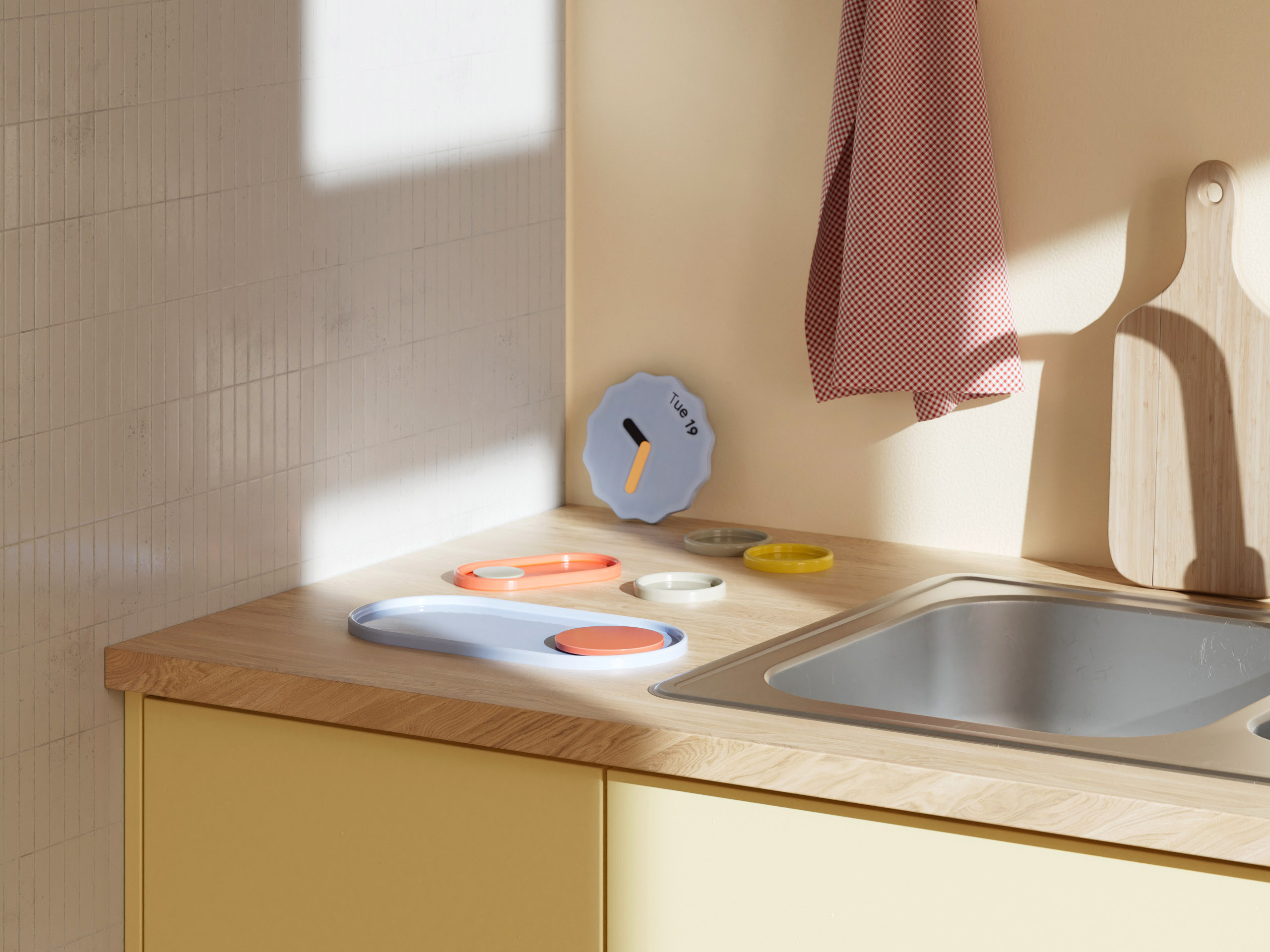
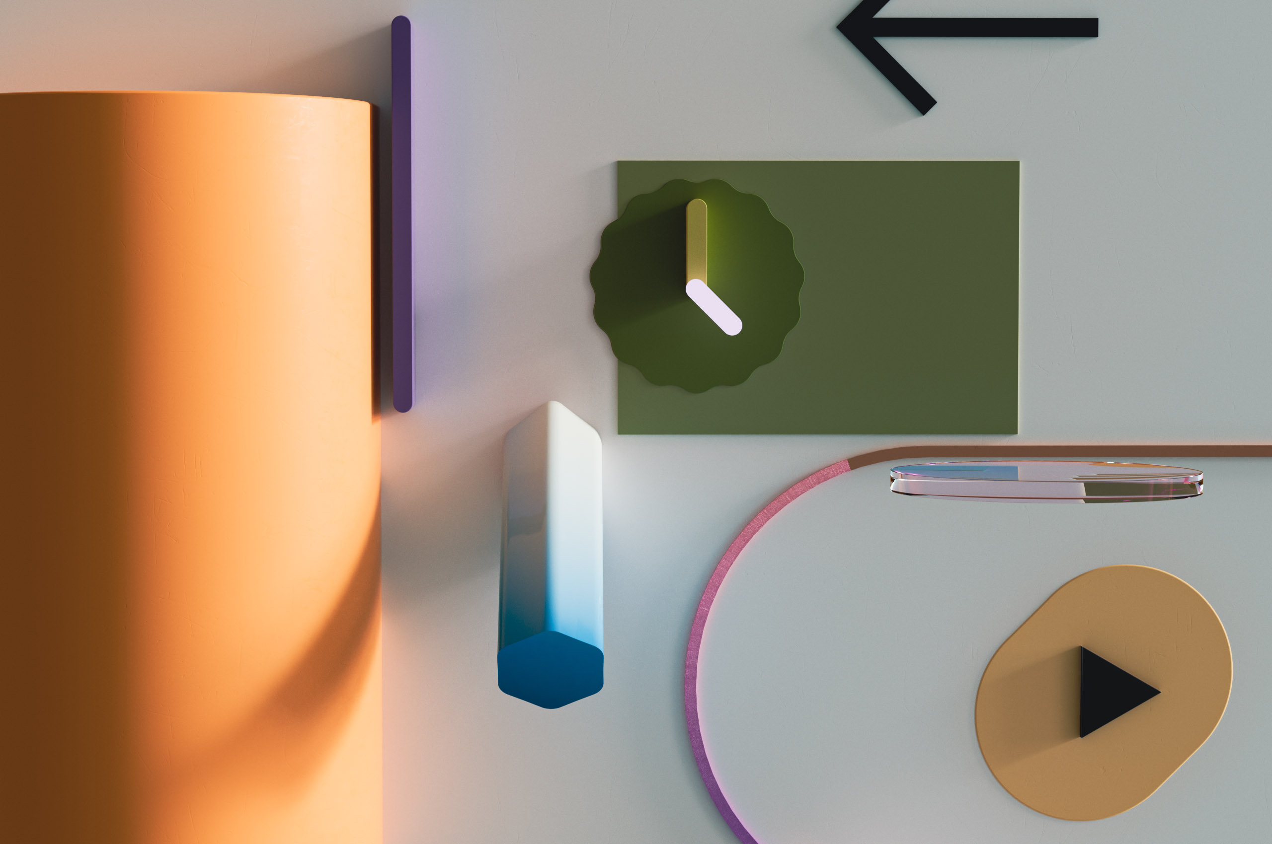
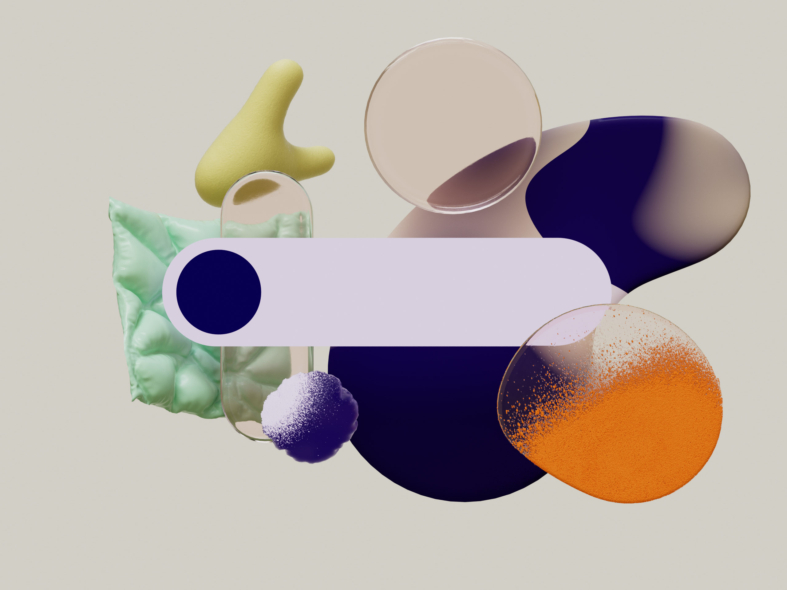
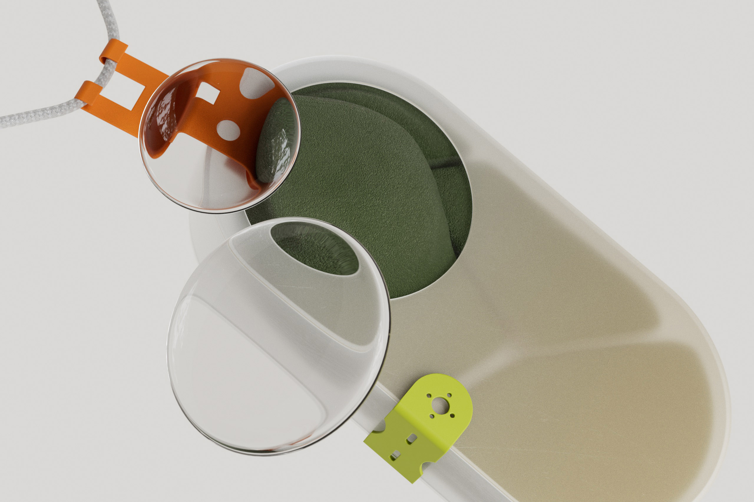
【Material Essence】
“Material Essence” finally reveals the full scale UI and its functionality (or creative interpretations of it). The user interface is shown as physical shapes with physical properties, interacting with the enviroment. The functionality of those UI elements is expressed with creative interpretations that use realistic everyday objects.
The objects are shown in spatial context, obey gravity and have clear directional shadowing on the surface they rest upon. The surfaces use realistic materials that reference real-world settings and the additional objects in the scenes have realistic connotations.

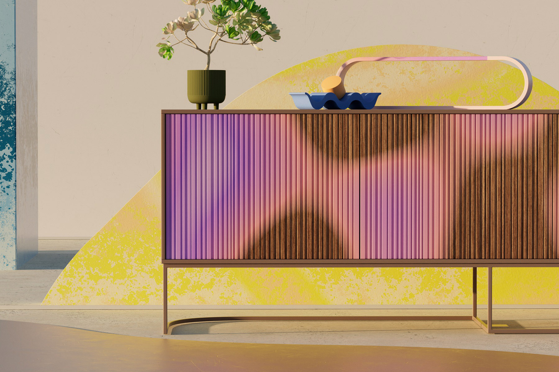
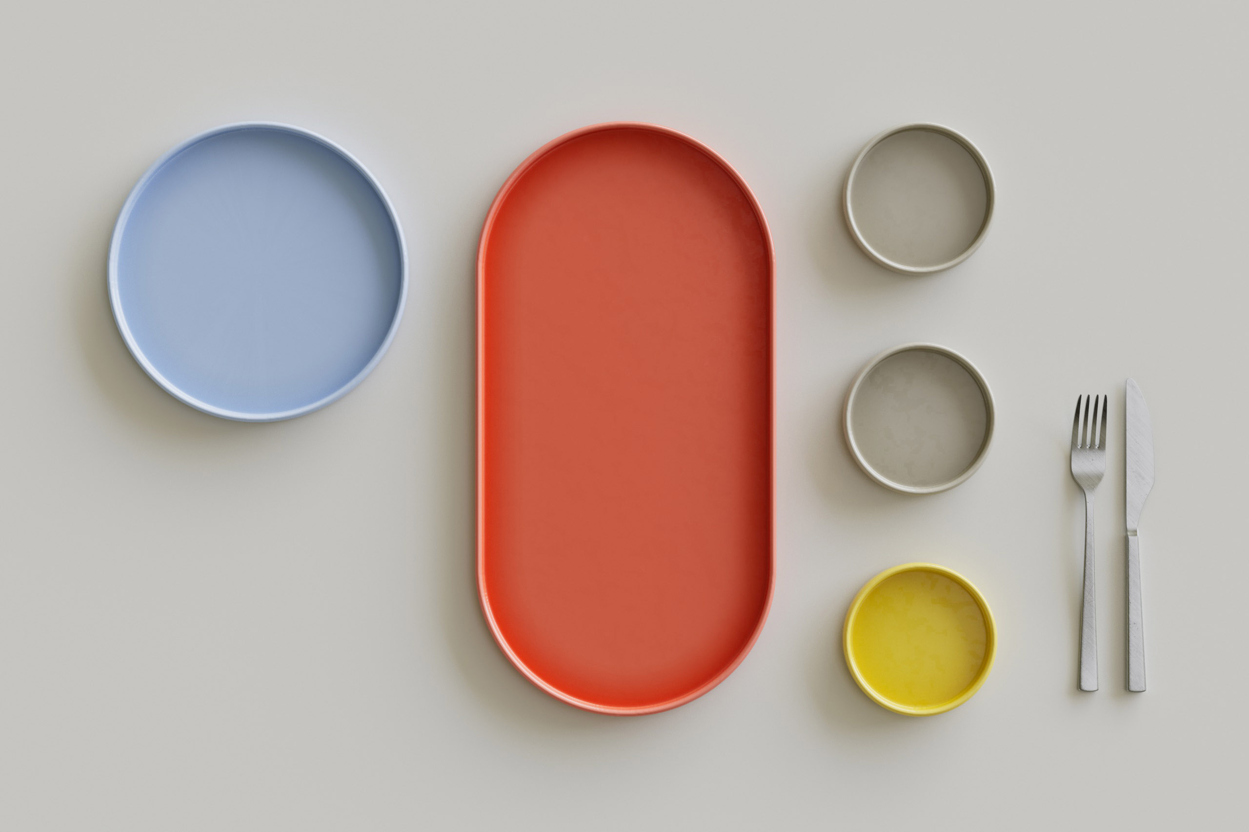
【Suite of Experiences】
Moving out further we reveal the environments in which the scenes of “Material Essence” are situated in. Livable spaces, desks, tables, kitchens, living rooms, are the stage for more explorations and interpretations of the shapes of the user interface.
Finally, we arrive at a realistic setting in which the actual devices, utilising the user interface, are showcased. Beautiful, warm and inviting spaces that reference “ordinary” scenes that the audience can refer to, thereby suggesting a natural habitat of those pieces of technology.


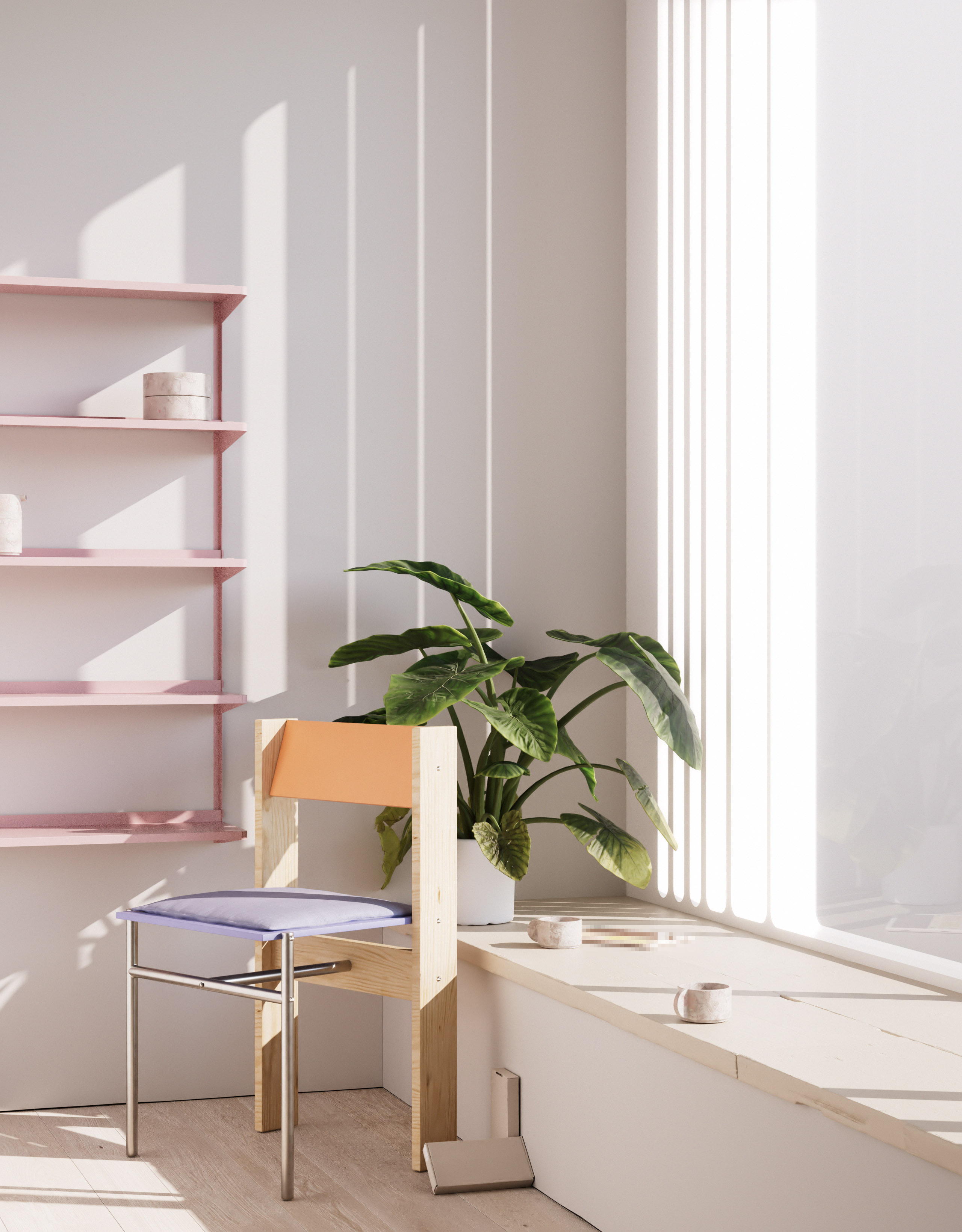
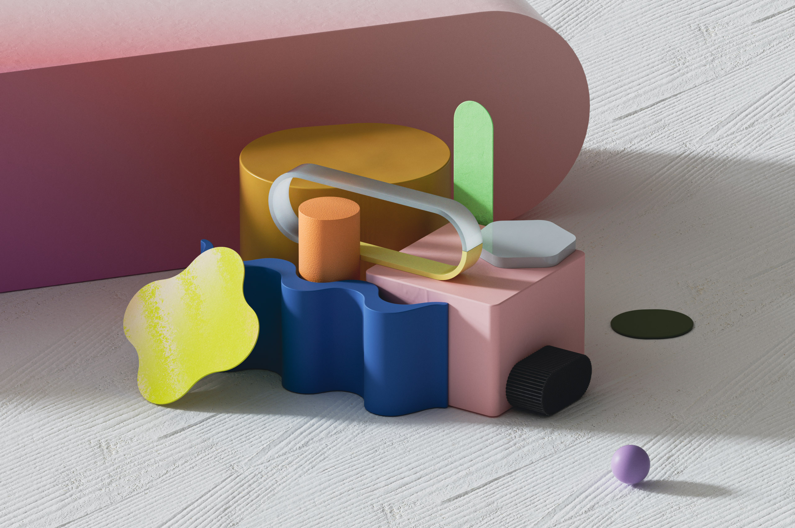
【additional development material】
While previous images defined the different categories we created, there was a wealth of additional design development material that is just as relevant. Following images describe our vision of a unique design language for Google Design’s 3D efforts
further. From additional explorations of the “Atomic Unit” and experiments of
combining 3D and 2D (referencing Google’s previously predominantly flat design language), to playful explorations of the idea of “soft UI” and more concepts around the creative interpretation of functionalities. Our goal was to create a large pool of ideas and concepts that future projects could draw from.


【credits】
Design & Direction
someform Studio
Creative Team
Matthias Winckelmann,
Helge Kiehl, Dominik Grejc, Yannik Wenk
Sound
Zelig Sound
someform Studio
Creative Team
Matthias Winckelmann,
Helge Kiehl, Dominik Grejc, Yannik Wenk
Sound
Zelig Sound
Client
Google Design
Client Creative Director
Nando Costa
Google Design
Client Creative Director
Nando Costa